COCCO.
Online Collaboration Platform for College Students and Remote Workers
Individual Project | 3 weeks | 2018 Fall
RESEARCH
VISUALIZATION
PROTOTYPE
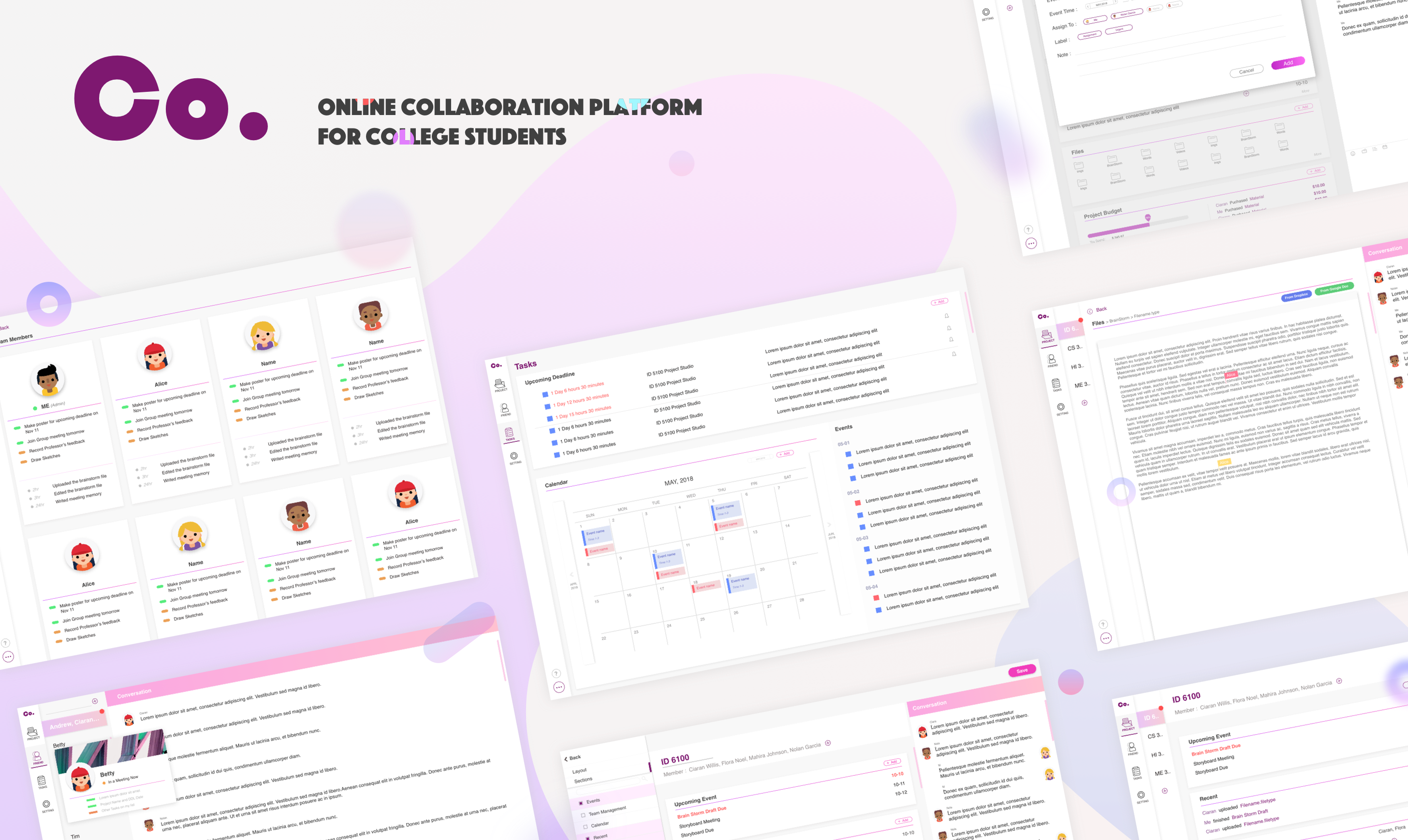
Have you ever experienced obstacles when team-working?
In most of classes in colleges and universities, students are required to team-work with students from different background on their academic projects together. While it is bringing a lot of benefits to students, it also put a challenge on students’ skill of collaboration.
It is reported that more than 90% of students have met with difficulties collaborating with others. Some even claimed that personal project is much easier than group project, which in some case is true. There should be something help students to collaborate together. First of all, let’s see what is causing this problem : Time schedule difference? Hard to collaborate? Can’t find a proper tool?

Let’s talk to users!
Quick Interview and Questionnaire
A quick survey was conducted among 20 students covering from engineering, design, computer science, business and art. The survey was mainly about what exactly those obstacles are, what’s the reason causing those obstacles, and what are their expectations. Let’s listen to what they said.
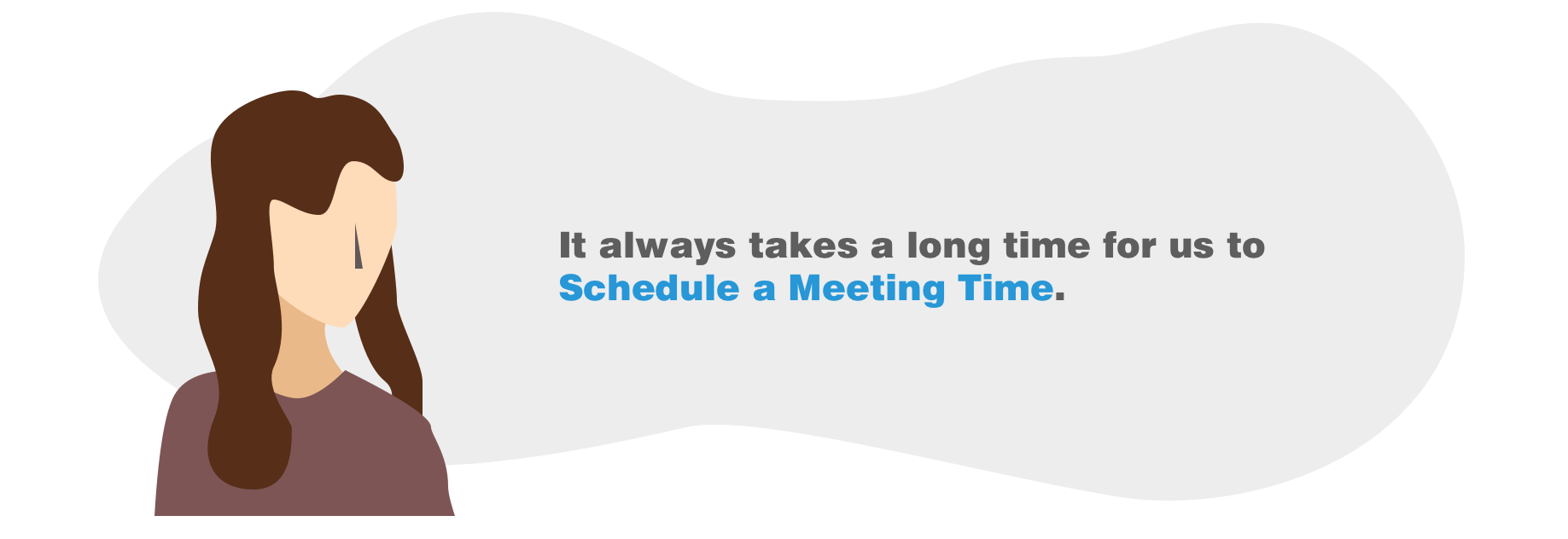
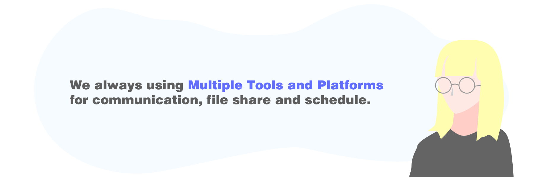
The survey result revealed that conflicting time and schedule is the biggest issue that most of students are facing. Especially finding a time to meet is hard. Other difficulties reported include hard to collaborate on a single platform, information can’t get communicated on time, ambiguity deadline and to do list, project timeline is hart to manage. While almost all students are facing difficulties, still more than 80% of students are willing to take group projects. When interviewing with those students, they mentioned that they can learn more in group projects, and the working context is more similar to real working environment in future.
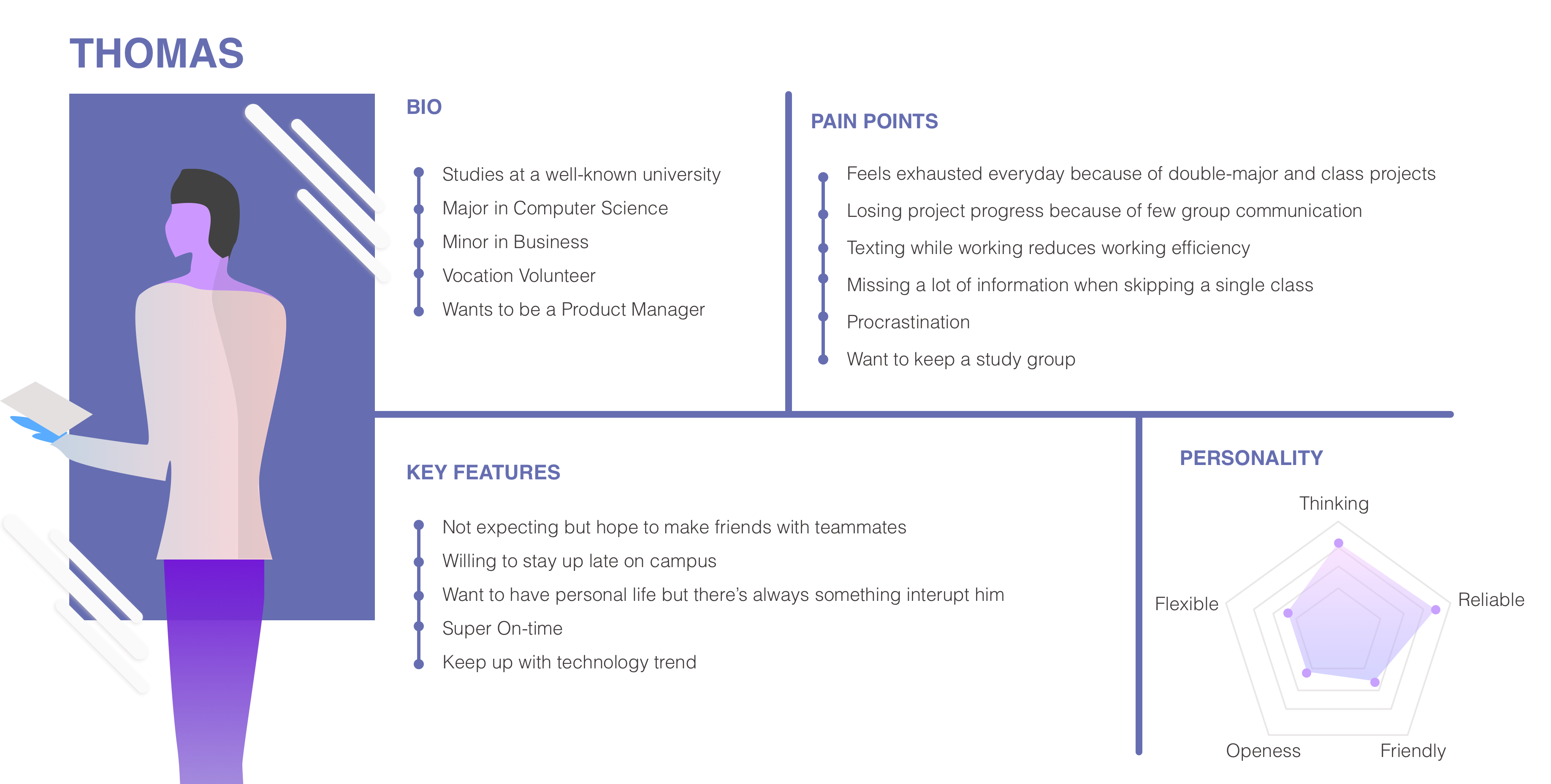
The typical user persona is a typical engineer student who wants to be product manager in future. He studies in a famous college but not ivy. In order to achieve his goal, he took business classes and product related classes. He always took 4-5 classes each semester, which fills most of his time. Each class has 3-4 projects including both individual projects and team projects. The main pain point of Thomas is to collaborate with different team mates when everyone has different time schedule and working preference. The primary expectation of this product from him is to help him regulate timeline and improve communication efficiency.

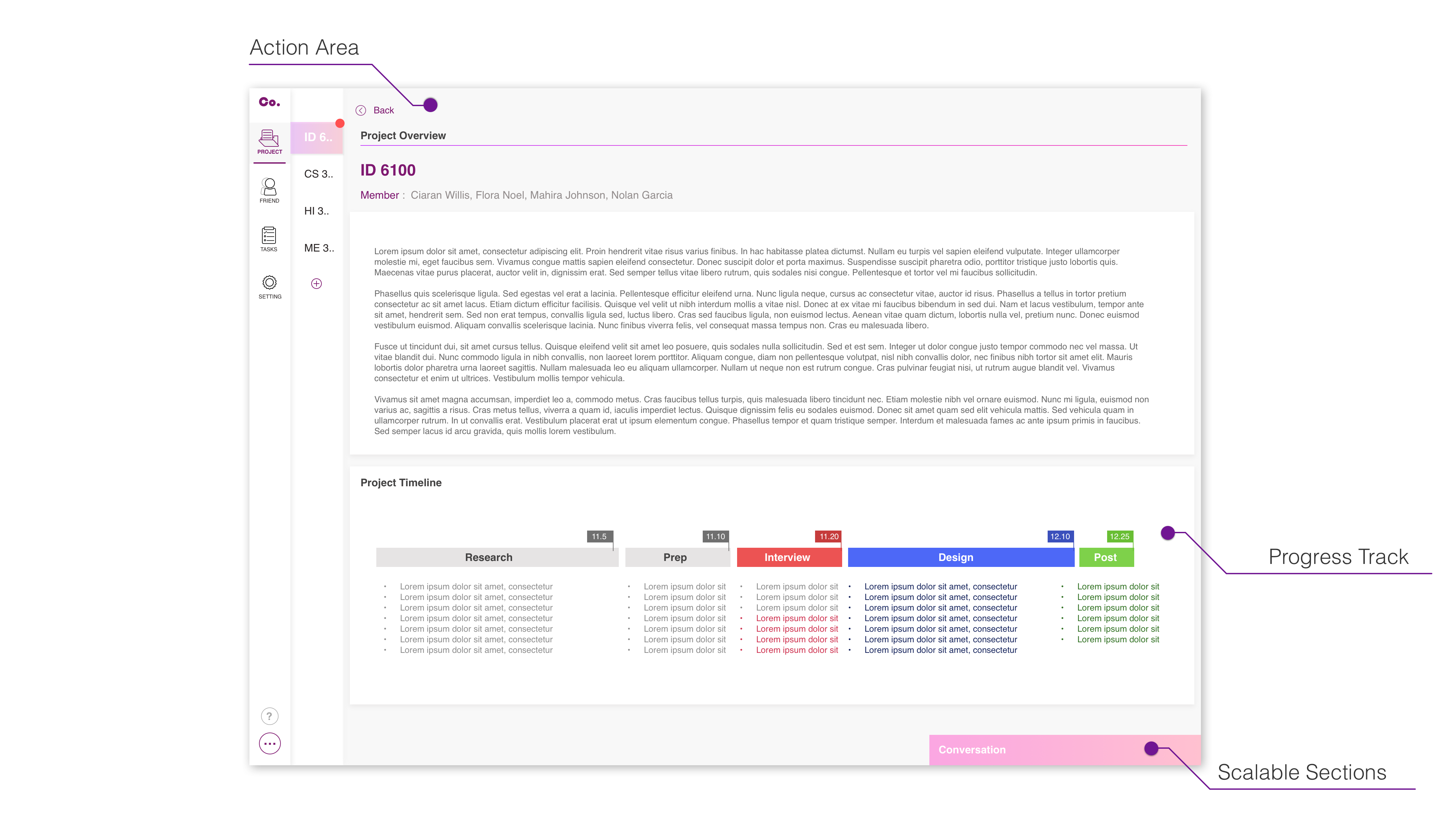
Although project progress varies from one to another, here is the typical project progress for a college project. Dividing the progress into four different sections, project progress as different stages, what information are being exchanged between teammates in each stage, what other intervene is from exterior and what team tasks are.
The final deliverable would be an online platform that can help students manage their project progress, improve online working efficiency, optimize collaboration experience and solidate team relationship.
What content do users care most?
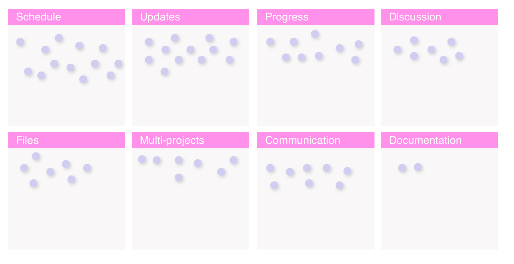
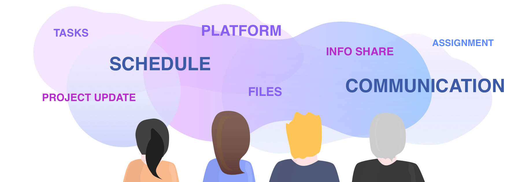
In order to have a clear content structure, i took out my interview videos and records again and start counting those “keywords” that appears in the dialogues. The most mentioned one are most likely to be the highest expected functions. Schedule and Updates are the most two frequently mentioned words that seems every participants is concerning about. The rest keywords were mentioned quite evenly. “update” and “progress” are actually quite similar to each other but different. I merge “schedule” and “progress” to a clear calendar to keep users know where they are and what’s next step in their project. “Update” has its own section because it’s telling “what’s happening right now”.
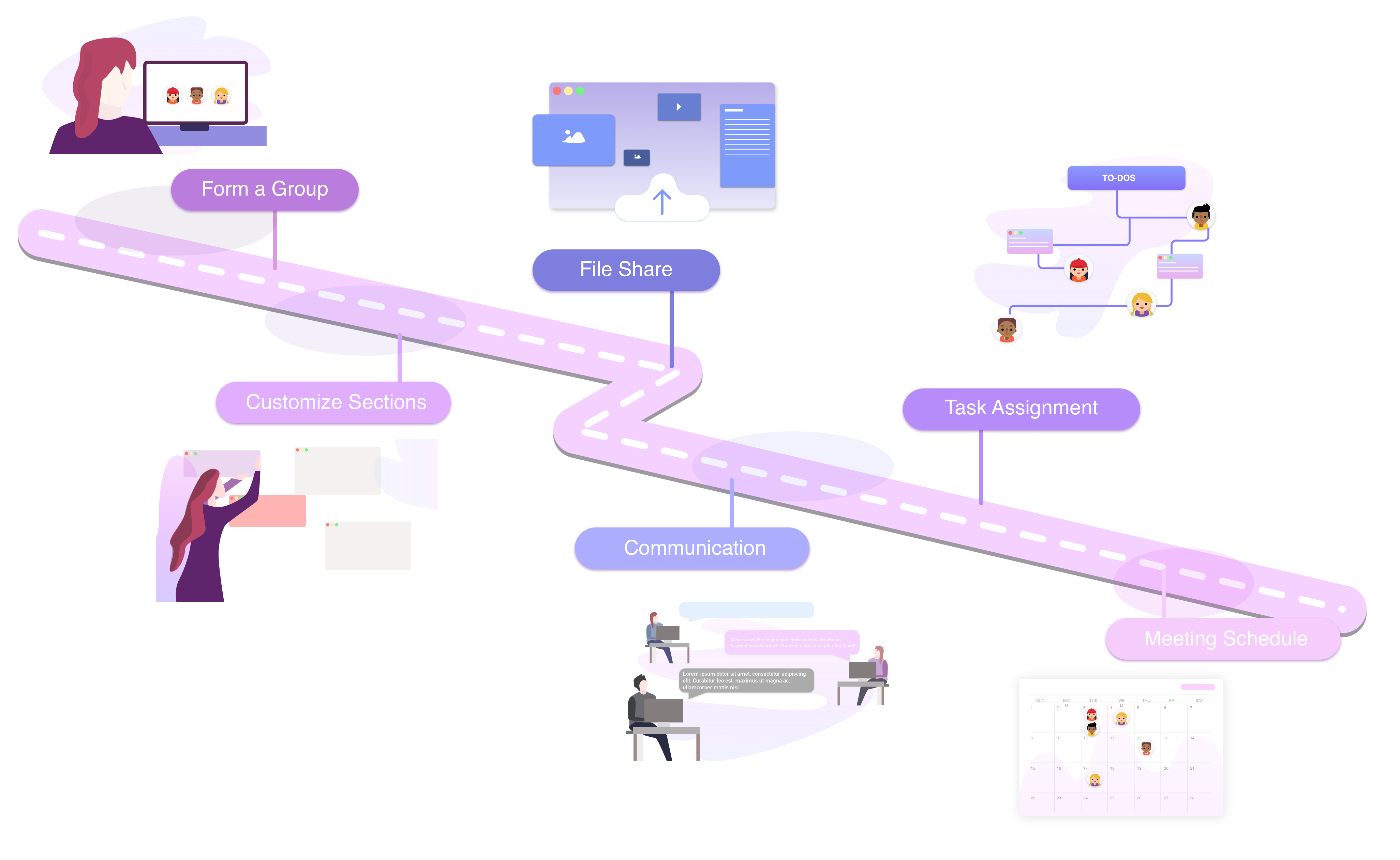
After learning the typical project progress and user needs, the six main design features come up in the mind. The goal of this project is to build a seamless collaboration platform that allows students to form a group, customize their dashboard and layout to fit in their projects’ schedule, and optimize communications including but not limited to online chatting.
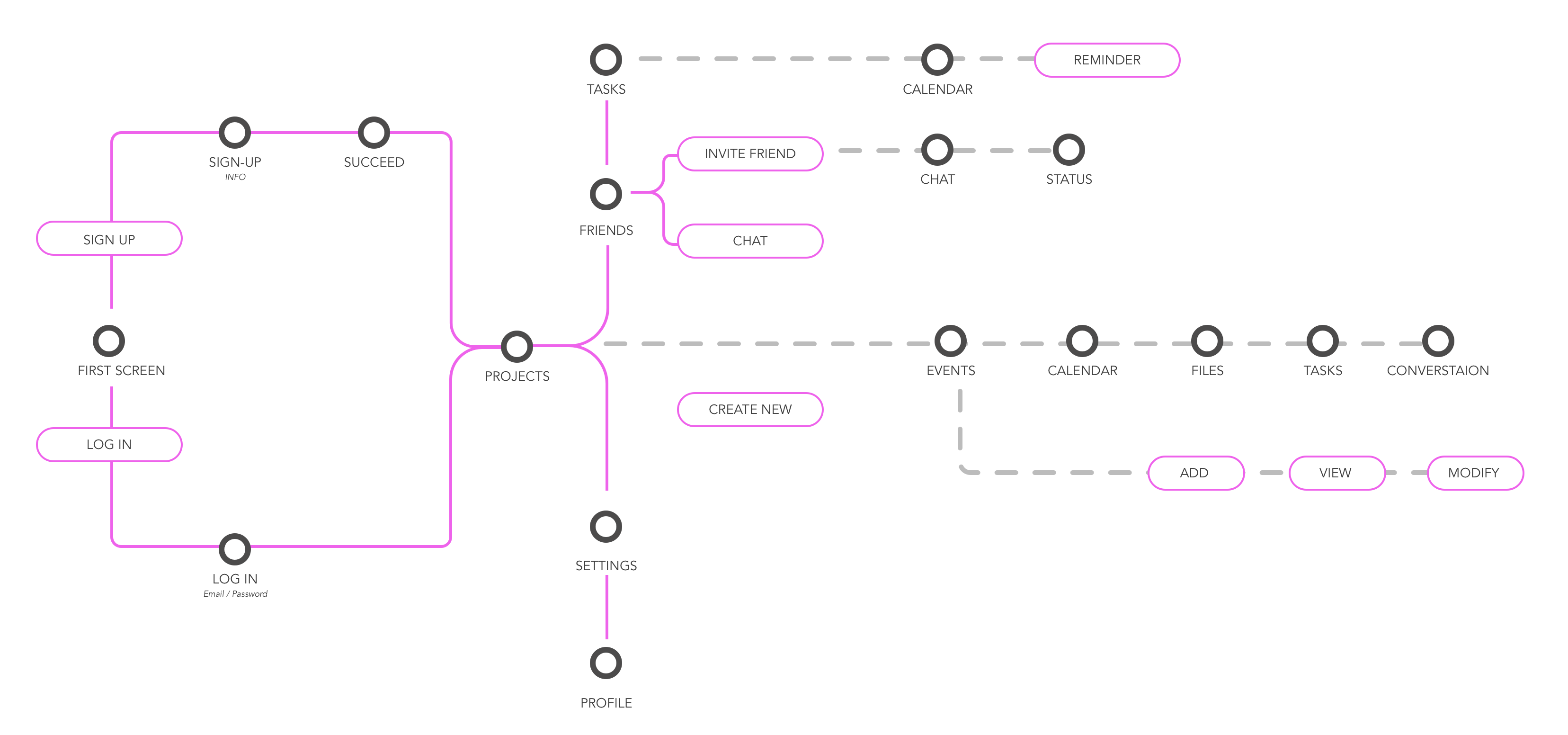
In order to help me developing the navigation system, the ideal user flow is designed. In the main navigation bar, users would be able to manage their project, get access to their personal task and schedule page, managing contacts, settings and maybe other open-source shortcut. The users would be able to online collaborating on the same file with teammates. All of their updates and working progress are transparent to their teammates. It would be easy for them to have a clear idea what is going on about which project, and what tasks are they supposed to perform in certain time period.
Being a college student software platform, ideally the product is designed to be open-source so that everyone can create useful plug-in. Especially for different majors, projects have different requirements on collaboration.
Can’t eat an elephant in one bite so let’s break it into small pieces!
Considering the scale of this project and time limitation, I chose to design keyframes instead of building up the entire product. Based on what I have so far, there are six different main features that I will focus on. Most of them are separate from each other in user flow, however, keeping consistency is also a big challenge for this project. In each key feature, I came up with a simple wire frame and information architecture to help build the product structure.
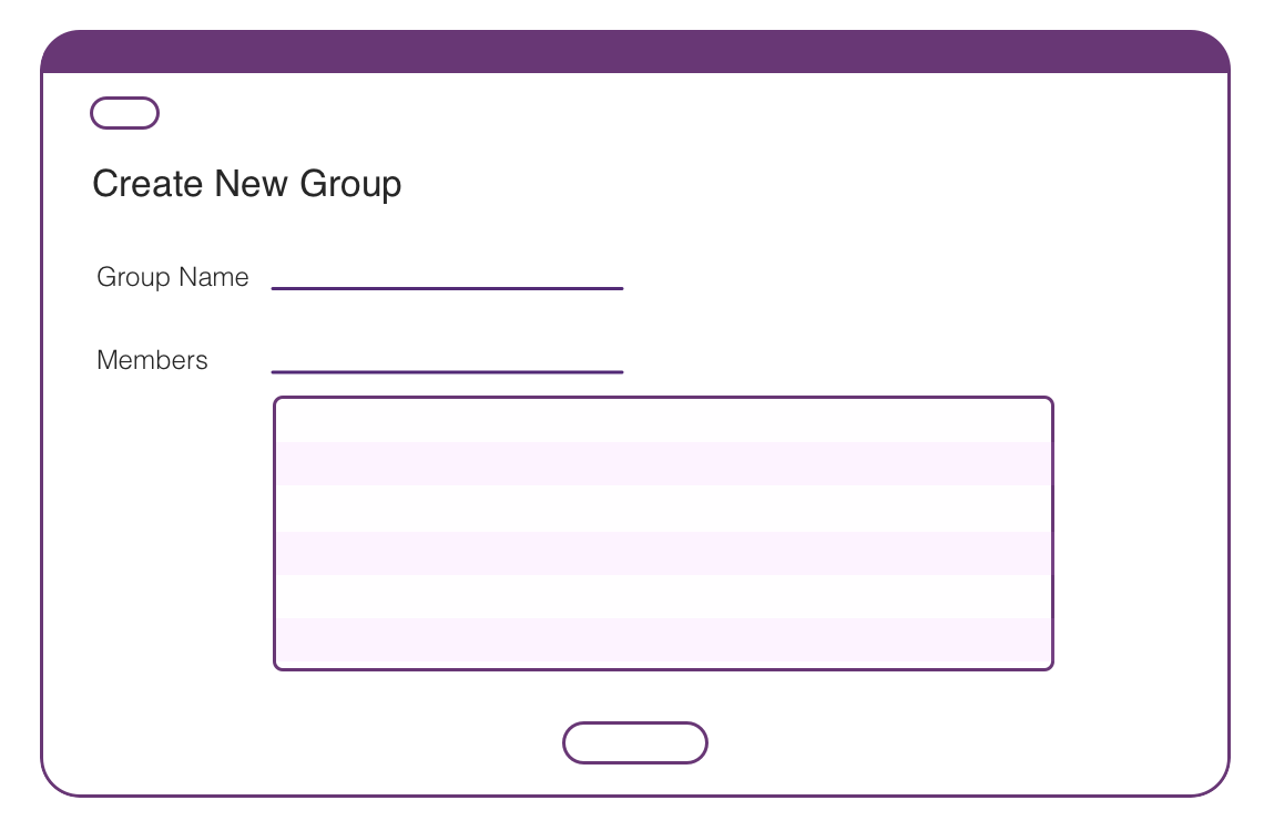
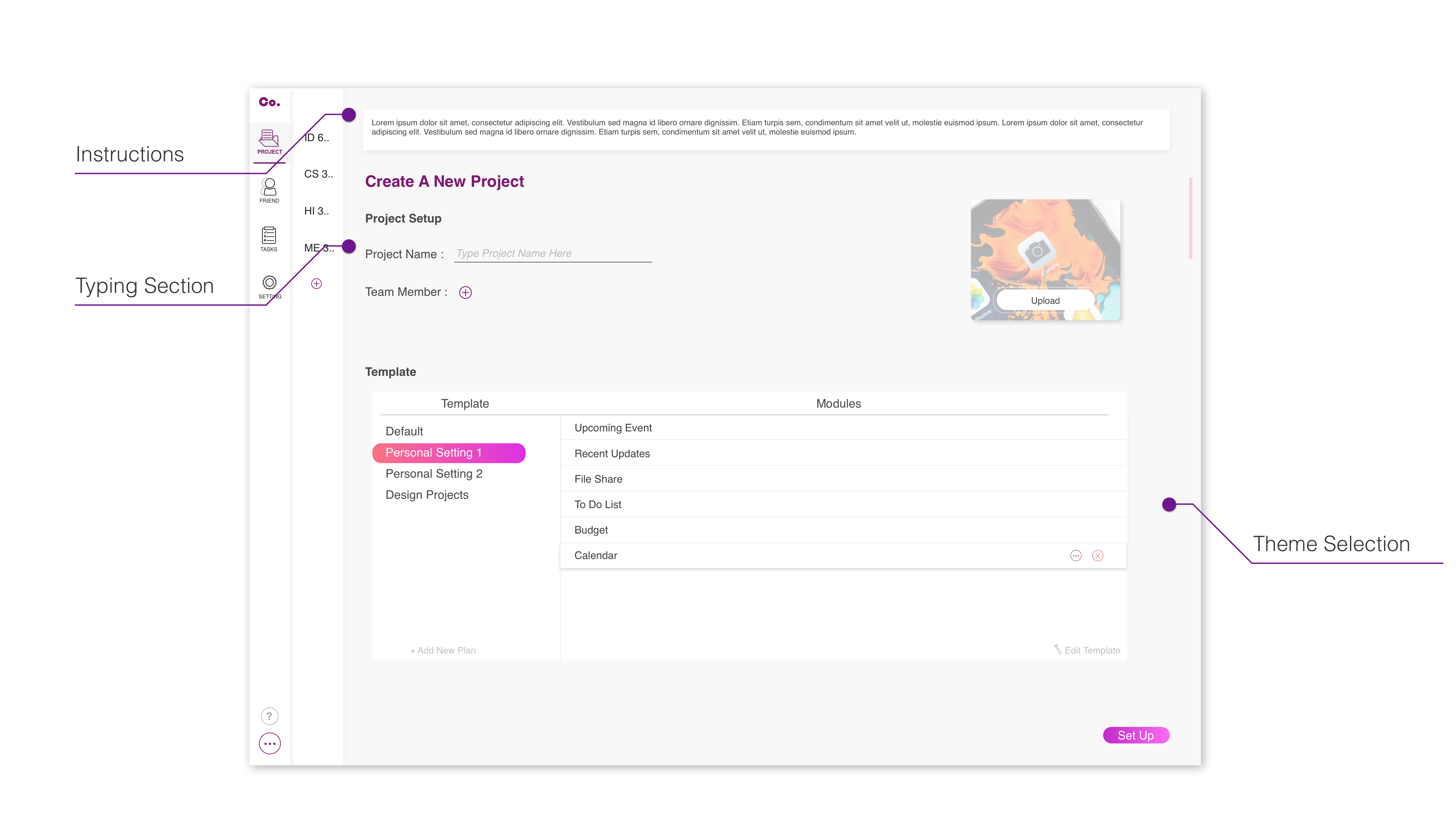
Form a group
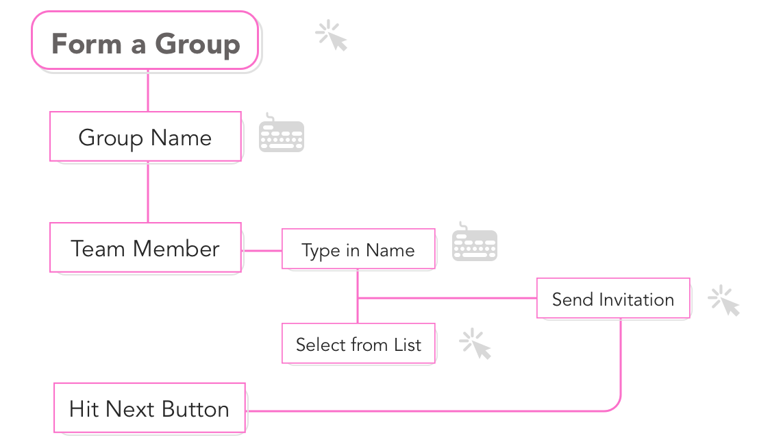
The first step after setting up the account is to form up the group. To form the group, user will need to send out the invitation to his/her teammate with a group name/ project name. The main challenge at this step is how to simplify the process and make it really easy because it’s the first step of using this product. The success goal for this step is being able to keep users and attract first time users. In order to keep it easy, i decided that only minimum information is needed to provide by users – project name, and team members. Although it has a lot of other information will be helpful if users can provide, but i don’t want users to be scared before using it.
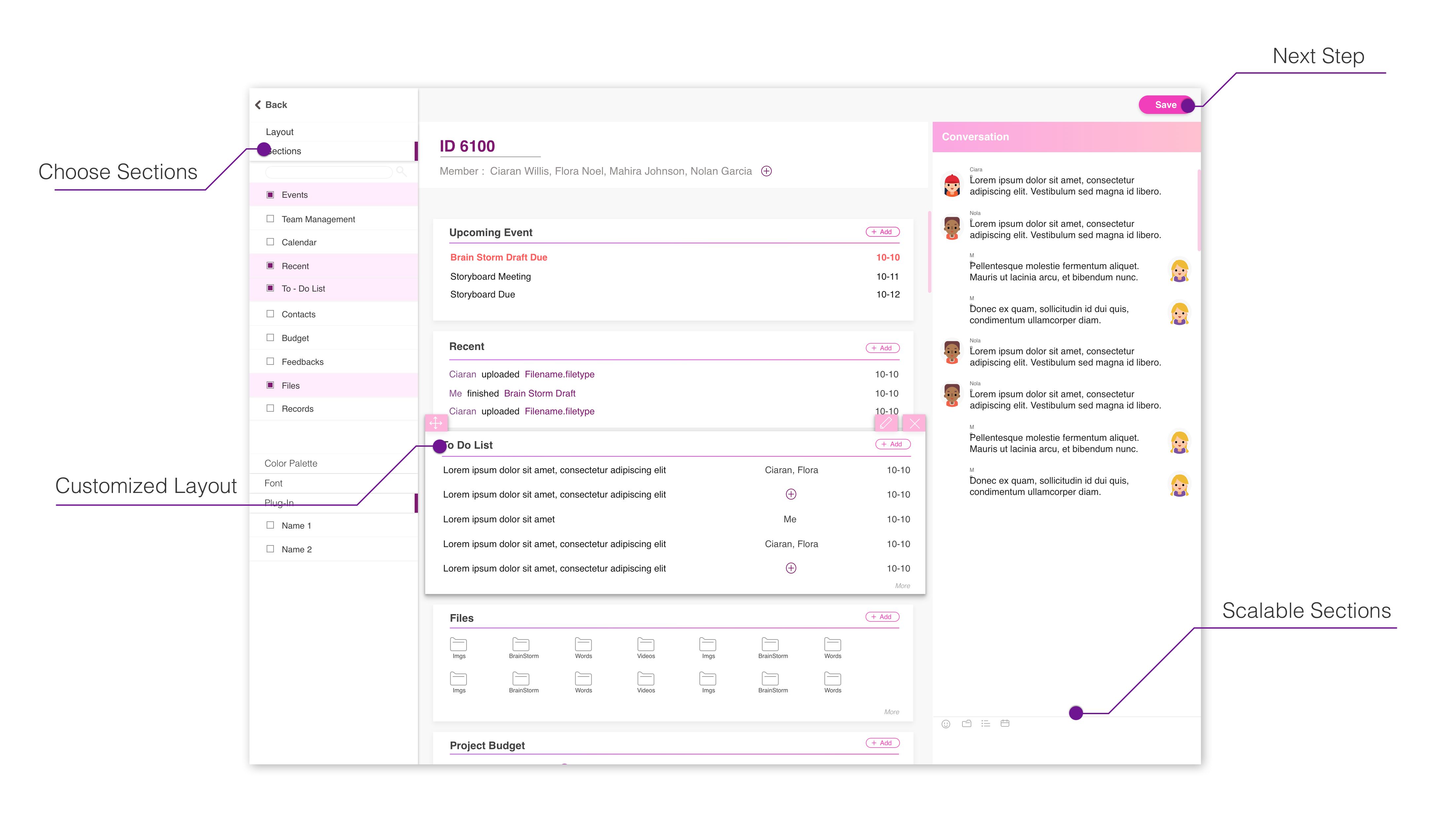
Customize Sections
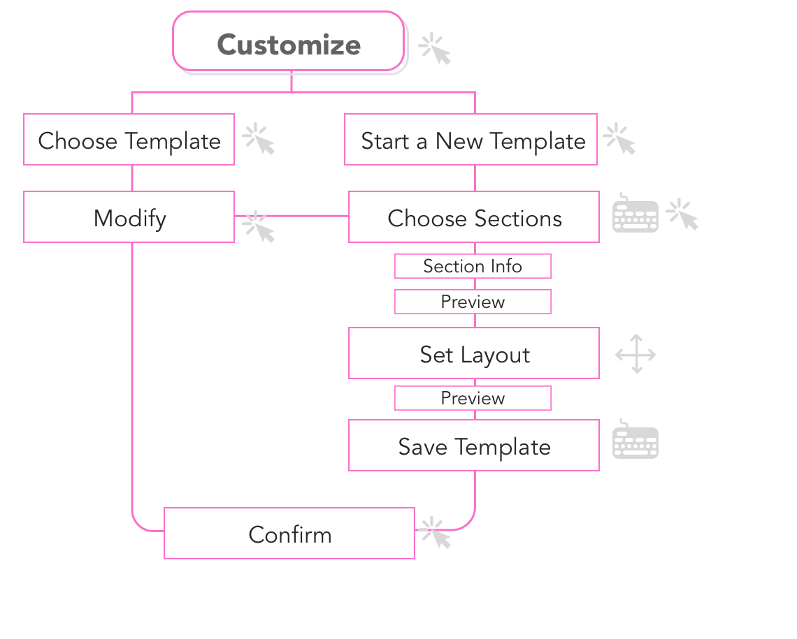
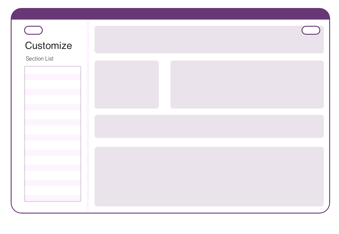
Because different projects in different majors vary a lot, the product provides customizing sections for both functions and layouts to users. There will still be default templates setting up for small projects or typical projects. In most cases, users will just use provided templates and make a little changes based on projects needs. Users can simply dragging sections into their dashboard and change the scale. Color palette and layout will also be open to change.
Chat & Communication
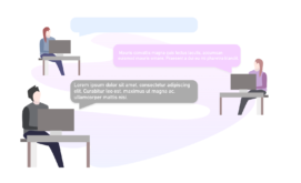
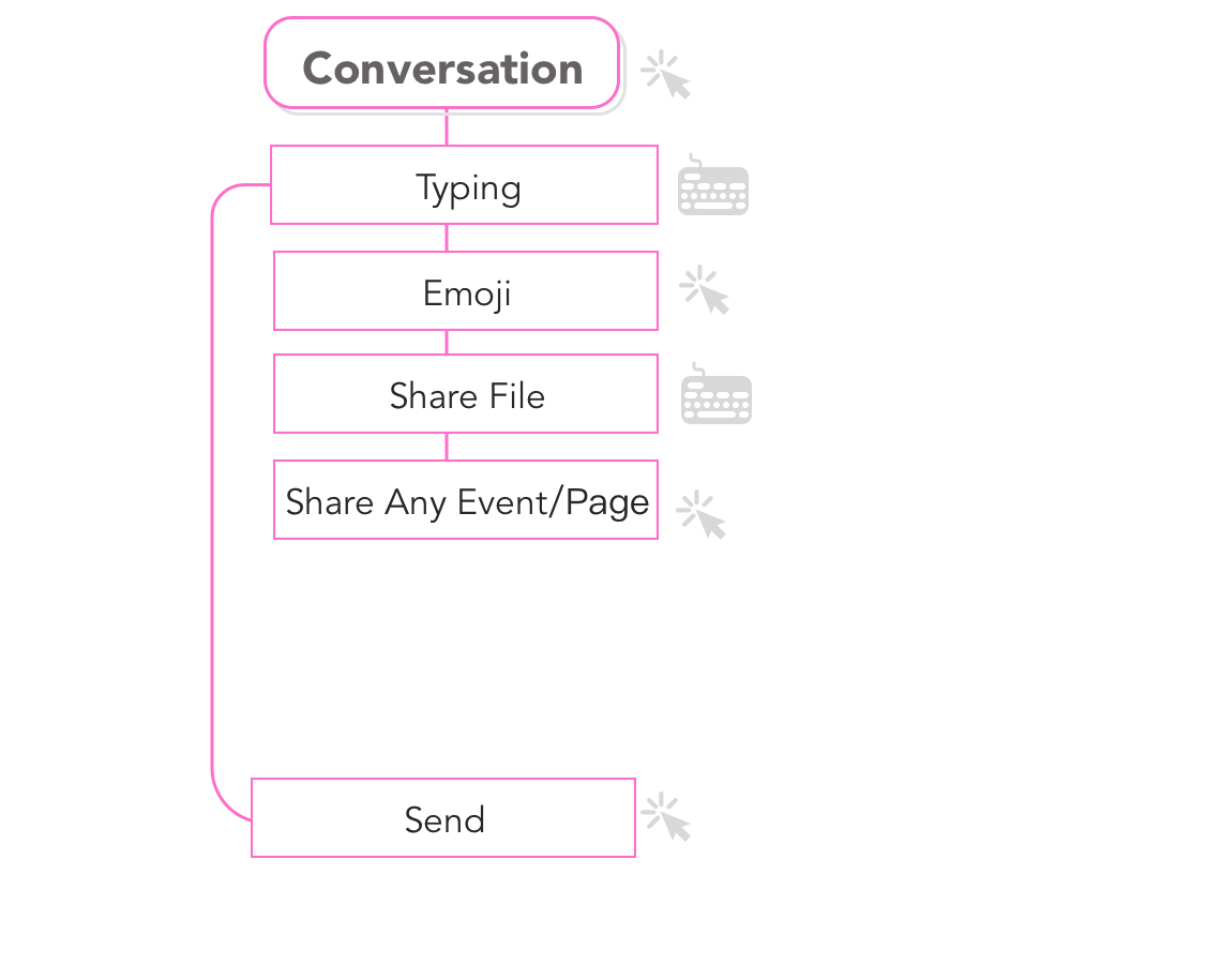
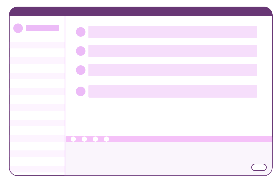
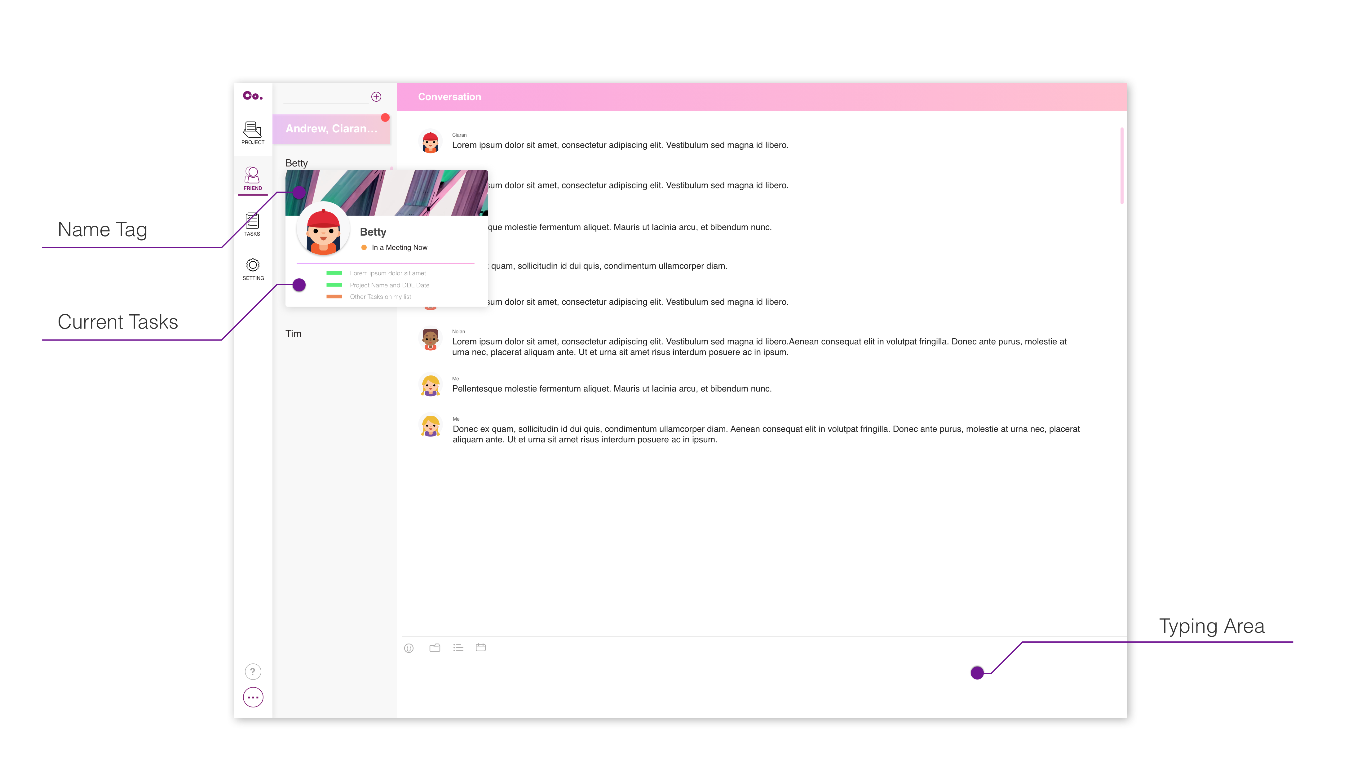
There are already a lot of online chatting platforms for different purposes. It’s not an “innovation” part of the product. The main goal of this part of widget design is to let users have no difficulty while collaborating, and allows multiple tasks going on at the same time while chatting.
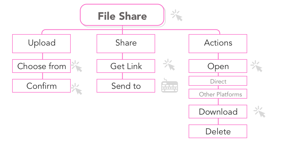
File Share and Collaboration
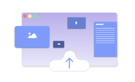
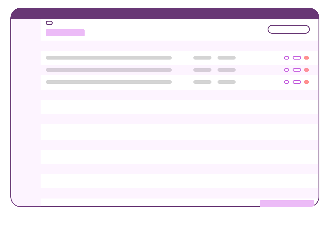
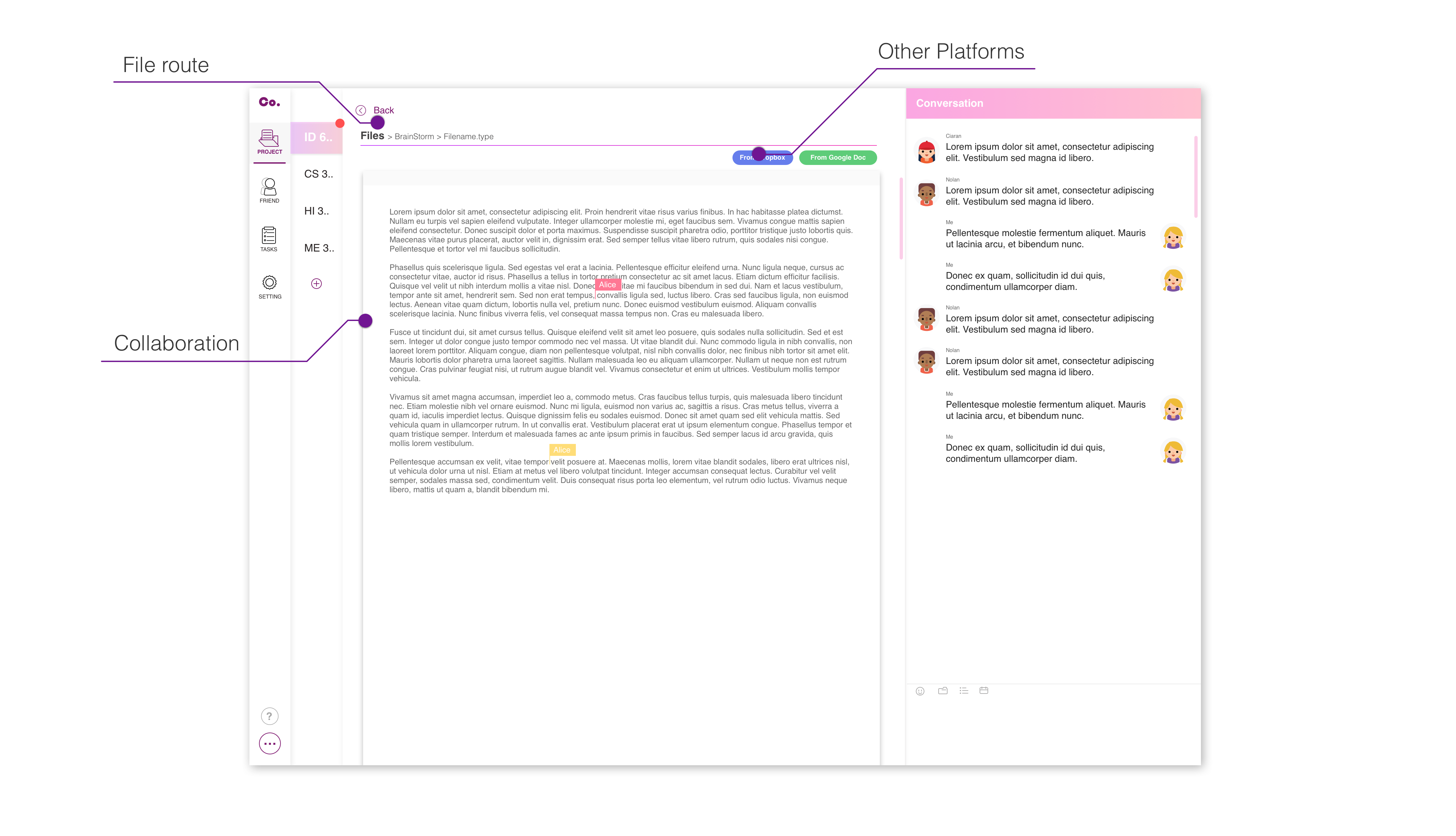
One unique feature about this product is to enable real time collaboration with online chatting so that everyone can share, upload , and keep updated with the latest project progress anytime.
Task Assignment
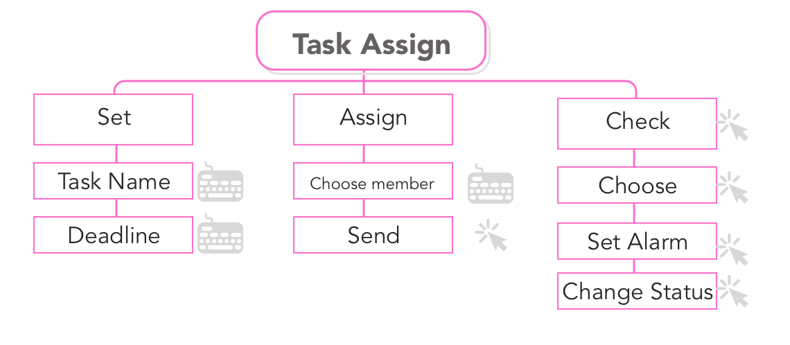
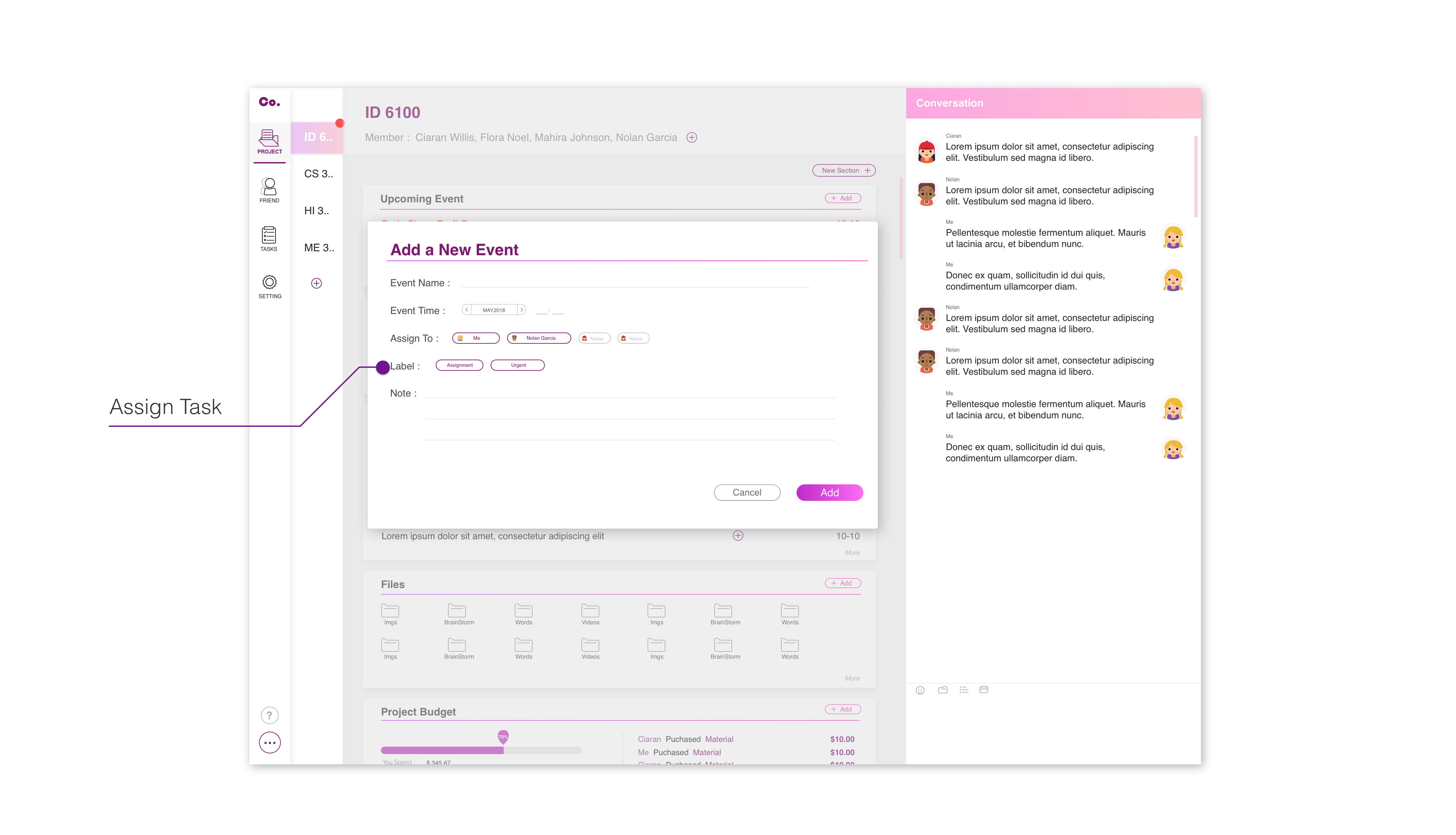
To help everyone being familiar with project progress, all tasks would be assigned to specific team members if they decide to start working individually. The task will save to not only the person’s dashboard as a reminder but also on others’ platform. Once the task is finished, the user can add a note or link to a file as the mark of finishing a task.
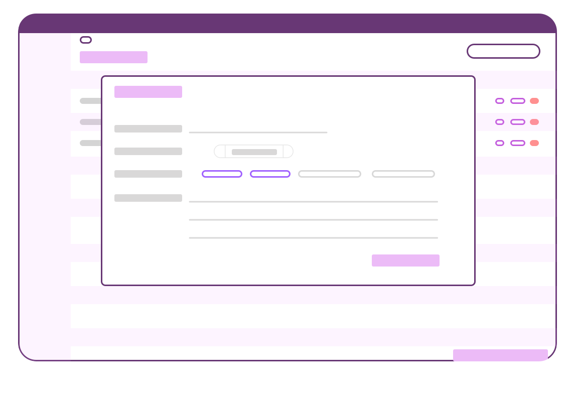
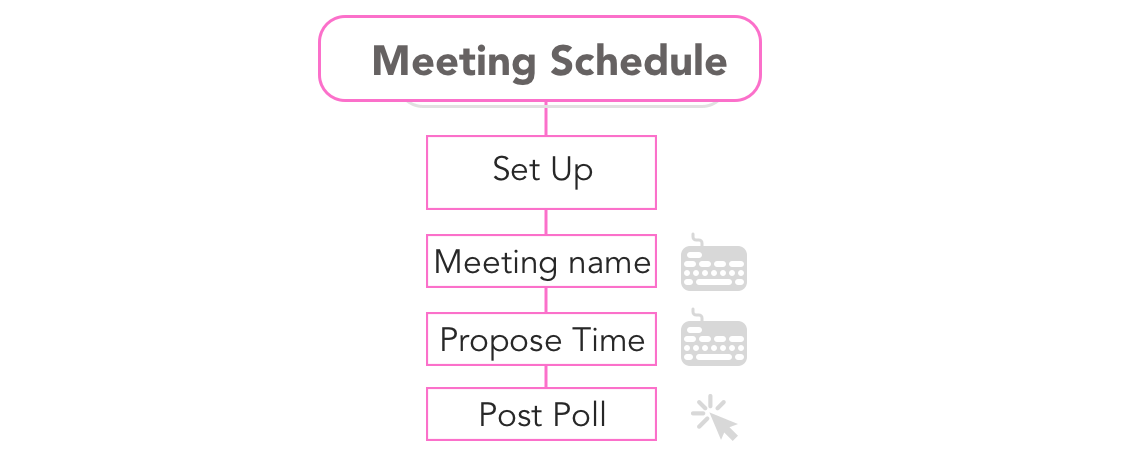
Meeting Schedule
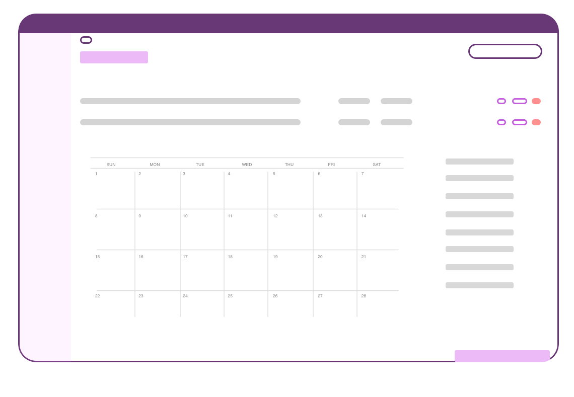
Scheduling a meet would be hard in a large meeting group. The meeting schedule function allows users to pull up their free time and automatically suggest a good time for meeting. Users can start a poll on meeting time as well.
Form up a group and set up a project
Customize Sections and Layout
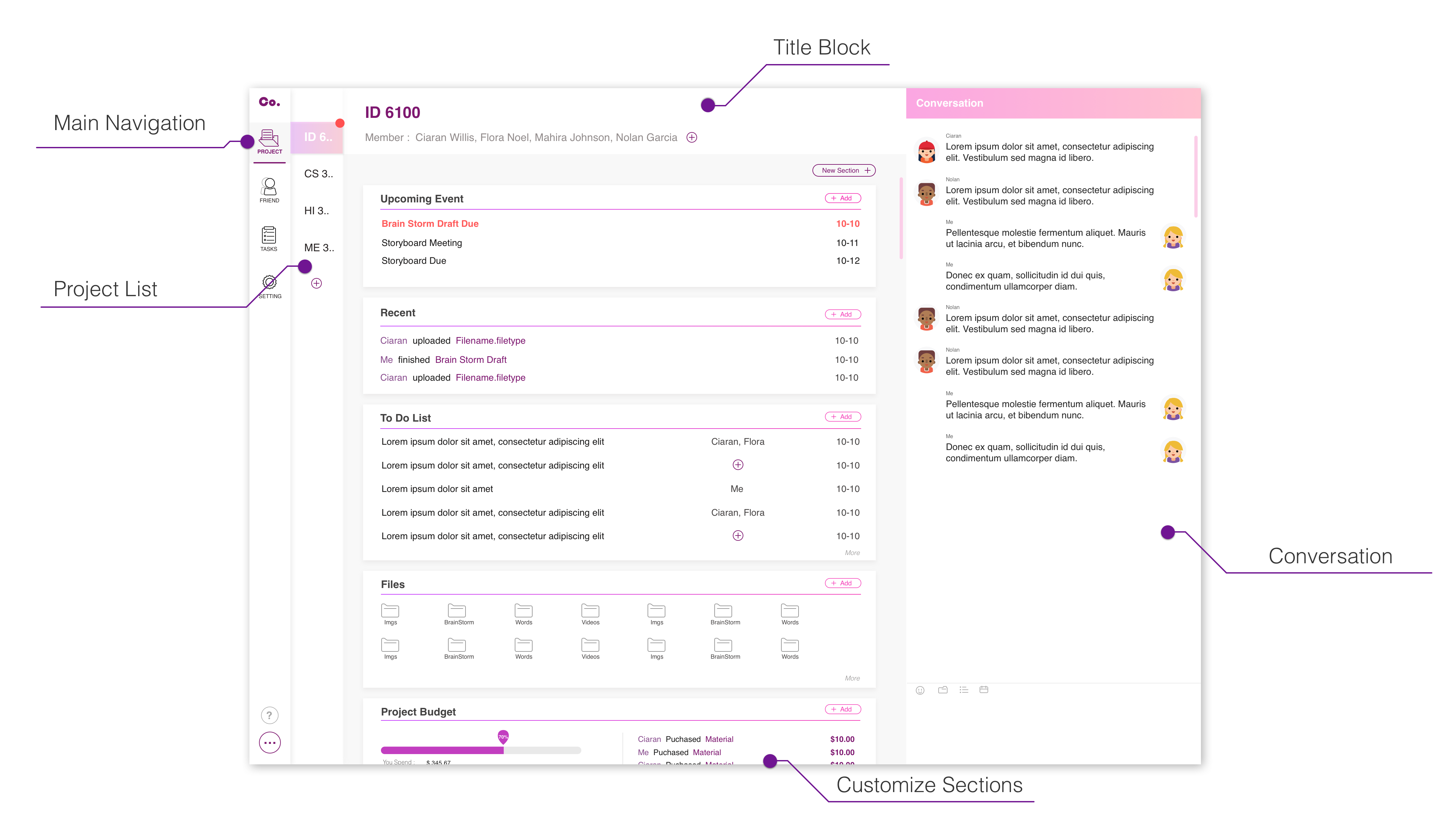
Project Dashboard
Project Progress
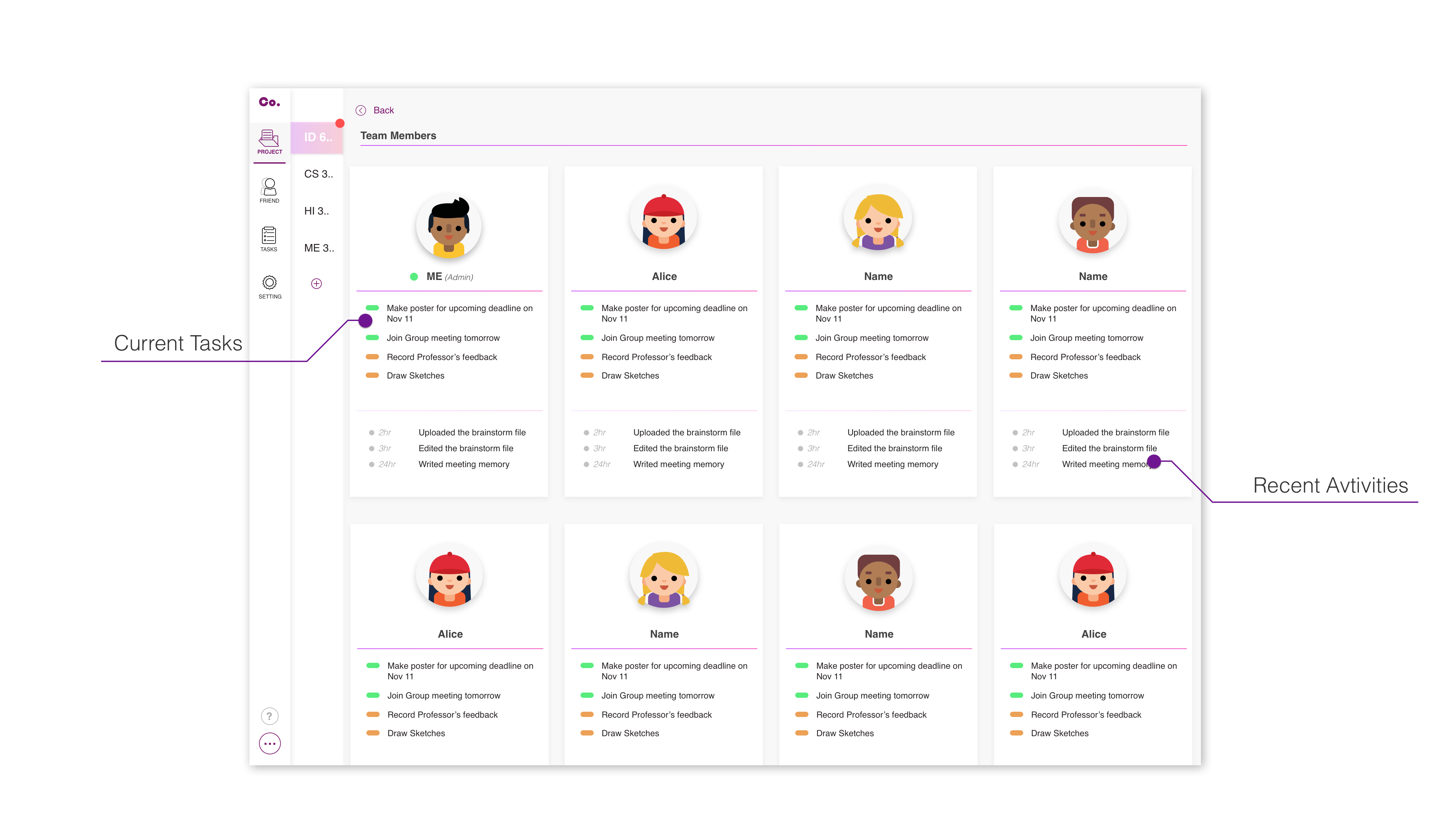
Team Members
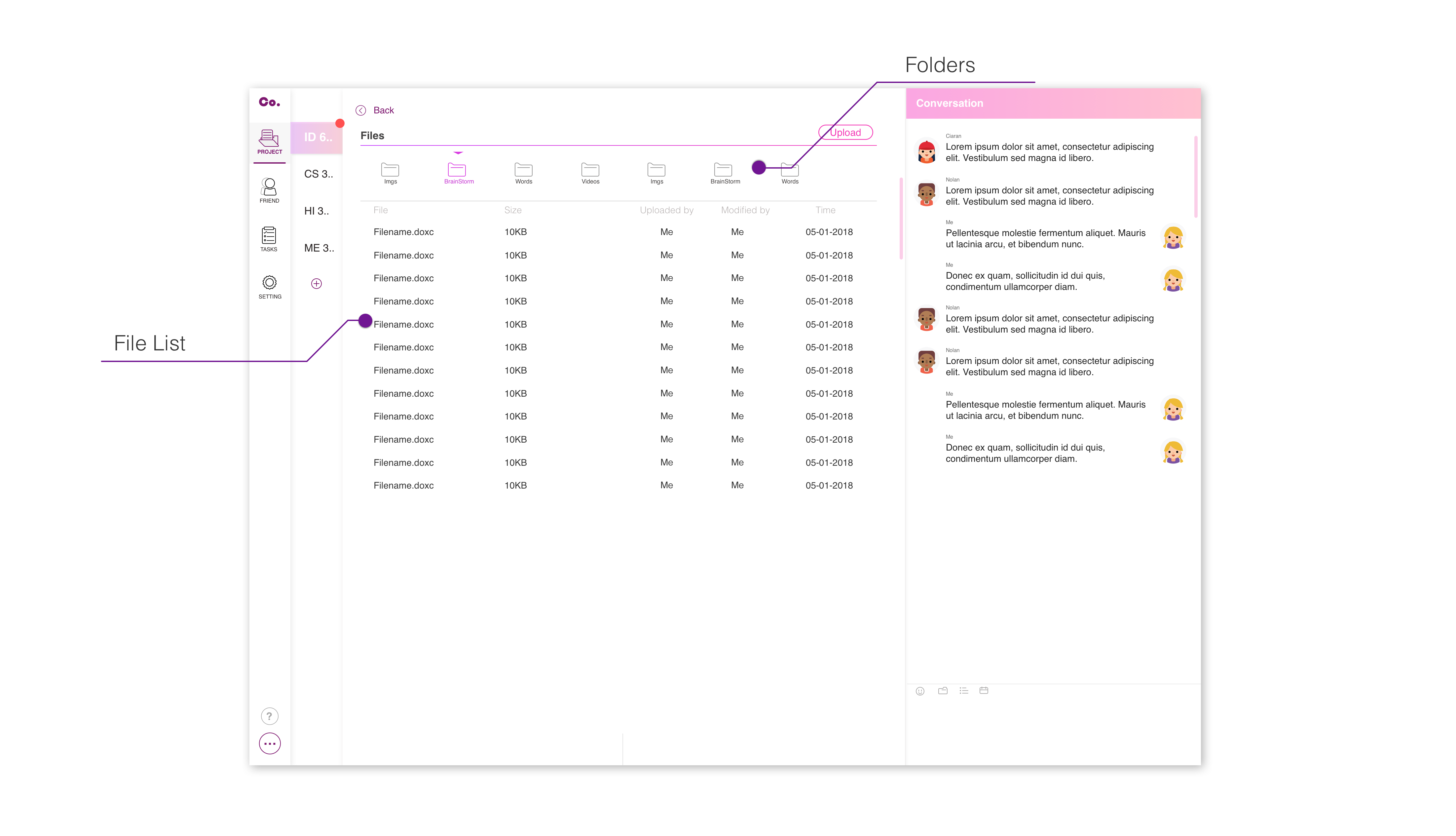
File List
Online Collaboration
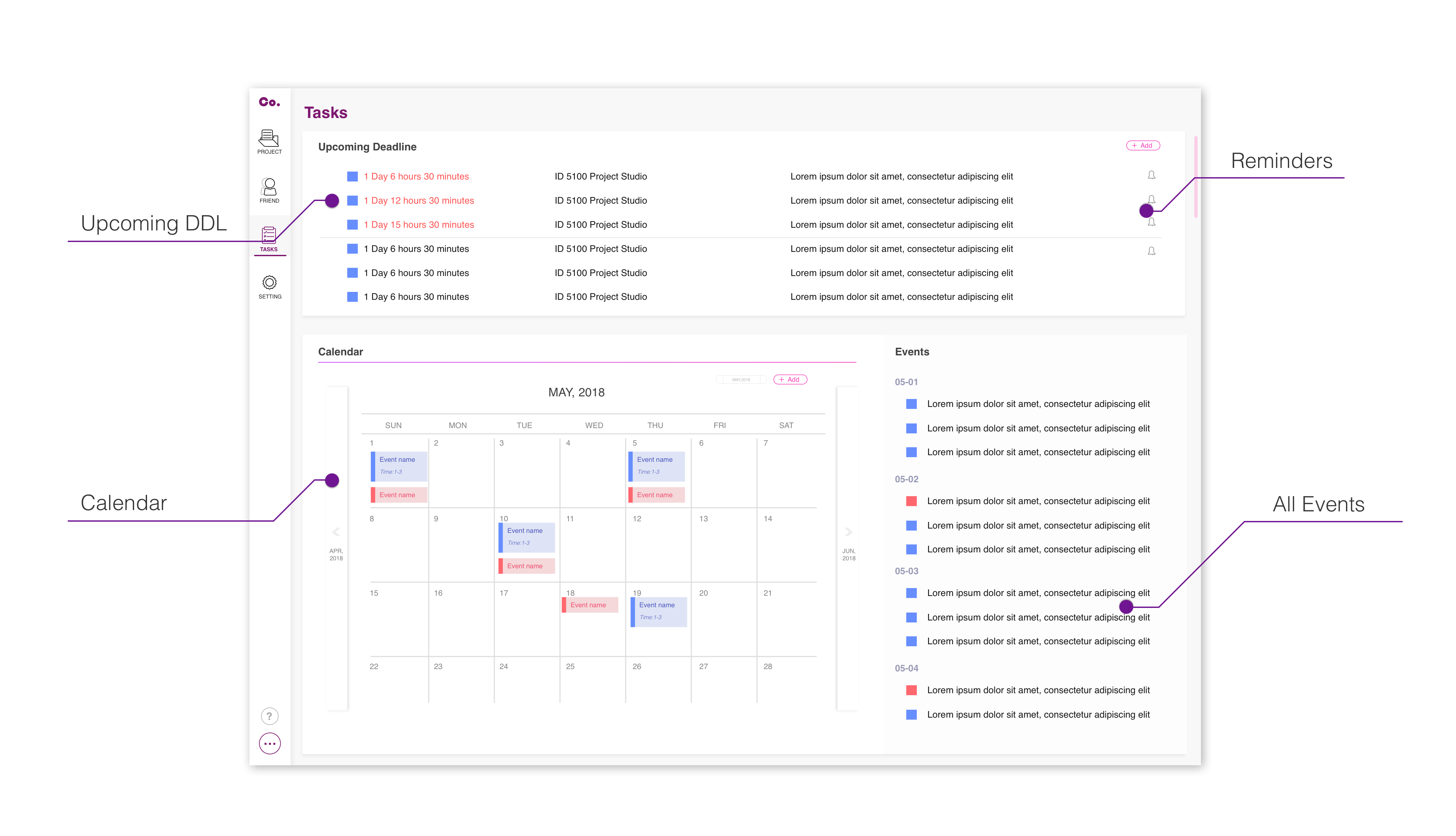
Personal Task Dashboard
Chat Room
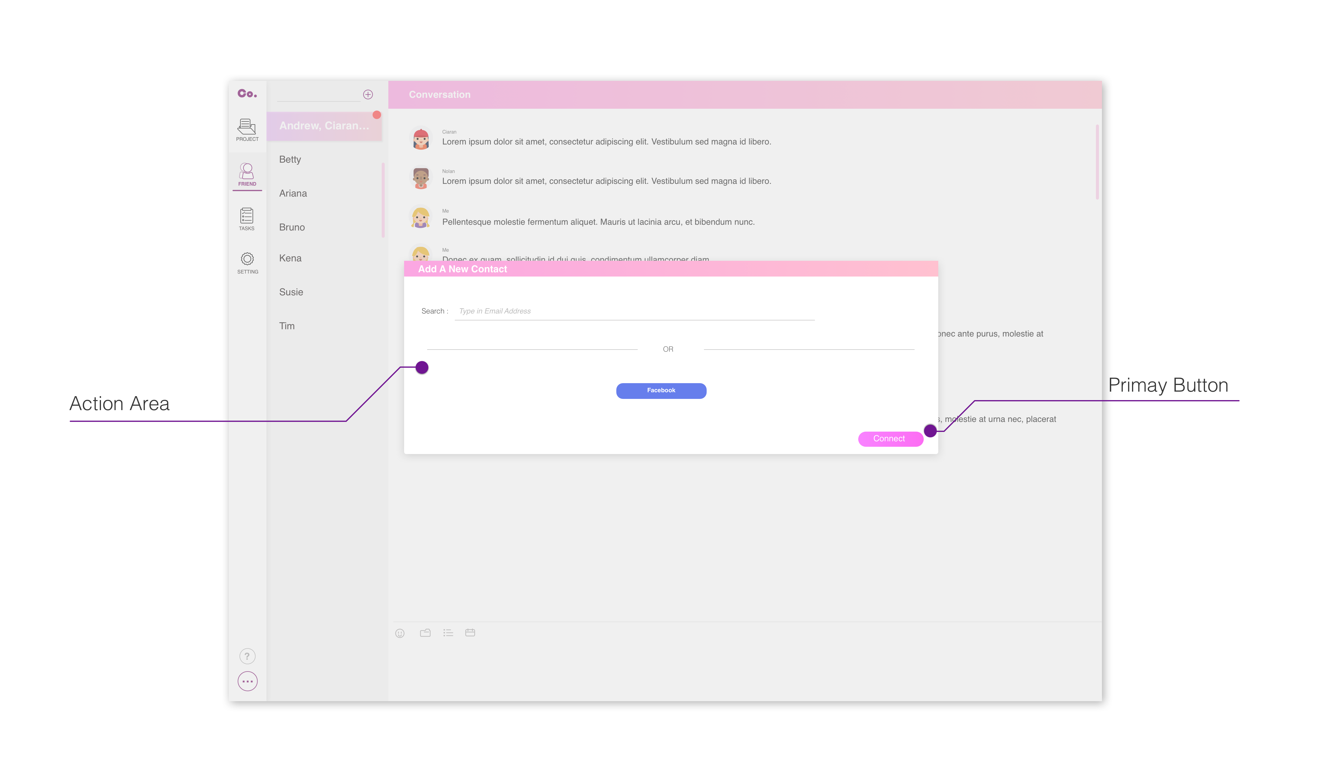
Add a new Contact
Add a new Event and Assignment
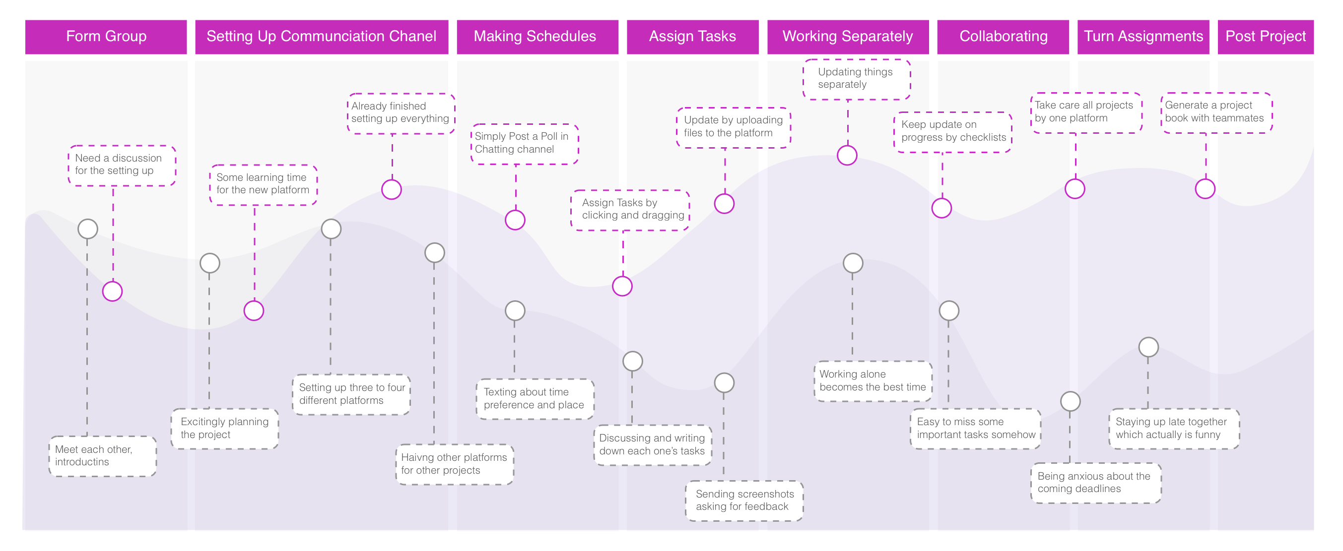
How user journey can be improved?
In previous group project collaborating process, it actually has so many possibilities to have frustrations. The beginning part is always the best when everyone is expecting a great project. The deeper the project goes, the lower satisfaction level all the teammates are having. However, with a collaborative tool, it’s changing the experience. In the beginning it would be a bit lower than traditional experience journey because teammates need to meet and set up the spaces. However because of in the beginning of project and semester students are having higher motion level so it can compensate the learning period. The more it is set up, the easier the following steps will be. With the help of this platform, it’s going to be easy to follow up with all projects’ progress.
What do users say about the product?
Overall Feeling about the Experience
“The navigation is good with text on small icons on. It didn’t take me too long to figure out what’s the function, where the sections are. Visual is clear. Although it’s only a demo but I think it’s clear enough for users to follow the product.”
Your Favourite Features
“I like the way how everything can be shared and accessed in the same platform. Usually when my teammates and me collaborate together we need to make screenshots to communicate.”
“My favourite is to have update notification about all the tasks so that I can check my progress on all the projects easily.”
A-HA Time
“I like the feature of it automatically record everything me and my teammates did so that I can get documentation easily”
“Now I know how heavy workload my teammates are by learning their status and their updates! I’m not going to blame them too much from now on.”
Future Expectations
“I hope there could be more color palette it’s too soft and makes me feel i’m a girl ”
“I would be looking forward to actually implementing it into a college system that instructors can also take a look at progress and provide feedback anytime”
“Hope it could be compatible with other platforms such as Dropbox and OneDrive”
