
trave.Lo
Travel as a Local
PROJECT OVERVIEW
Individual Project | 7 weeks | 2018 Summer
RESEARCH
VISUALIZATION
PROTOTYPE
trave.Lo is designed as a public platform letting local residence sharing their daily routine with travelers especially international ones.
Design Space
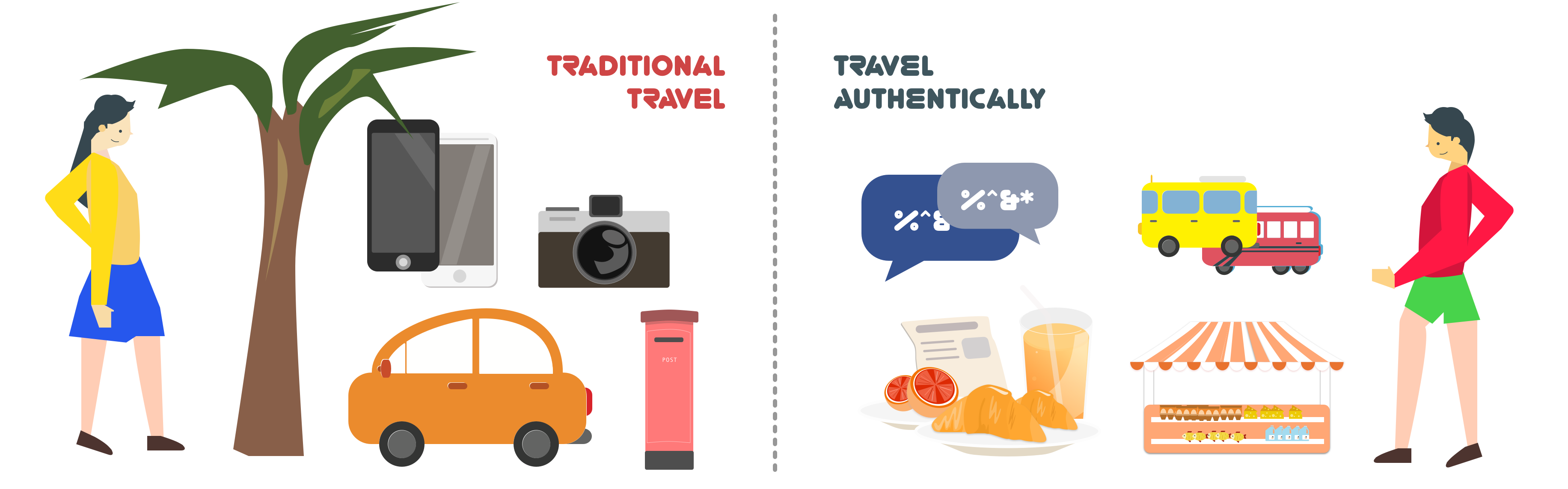
It is predicted that in next decade there would be a 35% increase on international travelers. Popular destinations has covered cities in Europe, Asia, NorthAmerica, etc. More travelers are pursuing authentic experience : instead of being a traveler, being a part of local culture. There’s quite much evidence for the trend. One of the most obvious signal of this is the popularity of Airbnb – Instead of staying in the standardized hotel, living in local communities has become a competitive option for travel staying.
There are multiple reasons for people to travel as a local. By putting themselves into a totally different culture, tourists are forced to get used to a strange language and unfamiliar environment which would train their ability to get used to new environment soon. The immersion among local residents would attribute tourists to learn new language and culture. The experience will teach tourists the lesson that even despite the differences from country to country, all people are similar and interconnected.
Compared to traditional travel experience, travel authentically is aiming at “spending your time like a local person”. Instead of visiting famous tourisms, taking photos and visiting as much as cities they could at one time, tourists that seek authentically travel experience would prefer renting an apartment(airbnb), slowing down their pace, wandering in the street, meeting and talking to local resident.
User Research
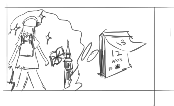
Several days before departing, you get really excited about the trip to a strange country.You can’t wait for it.
You started planning where to go. You read through thousands of articles just looking for recommendation.
It’s really tough for waiting. You keep adding more things to do on your list and make a really perfect travel plan.
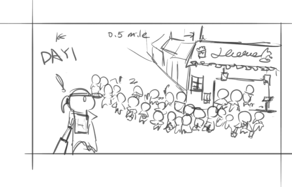
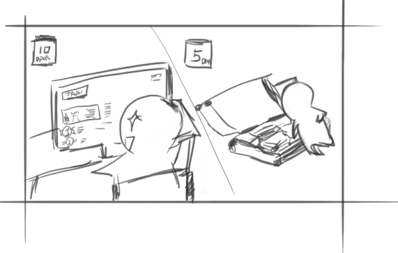
As soon as you land, you dash to the restaurant that almost everyone recommended to go. At first, you think you would feel a little embarrassed because you are carrying your luggages. It turns out that you are not the only one with your luggages in the incredible long line.
You decide to get into the line waiting for it. The crowded restaurant can’t help you relieve your drowness from long time flight. It’s getting a little bit worse especially when you see the expensive menu. Apparently most of customers sitting near you are also travelers.
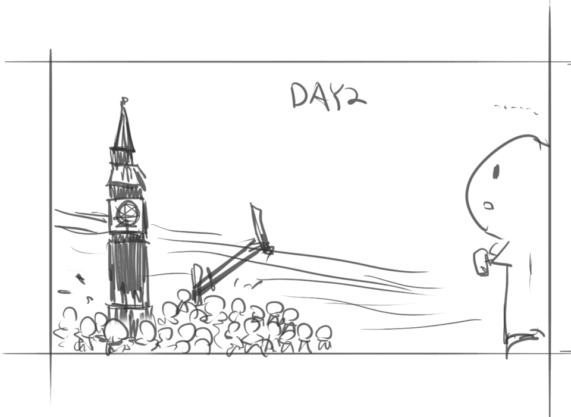
Officially your holiday start. You put an entire day for a famous tourism. You arrive there in early morning and surprisingly find out it has already filled with tourist. You start getting used to the long line.
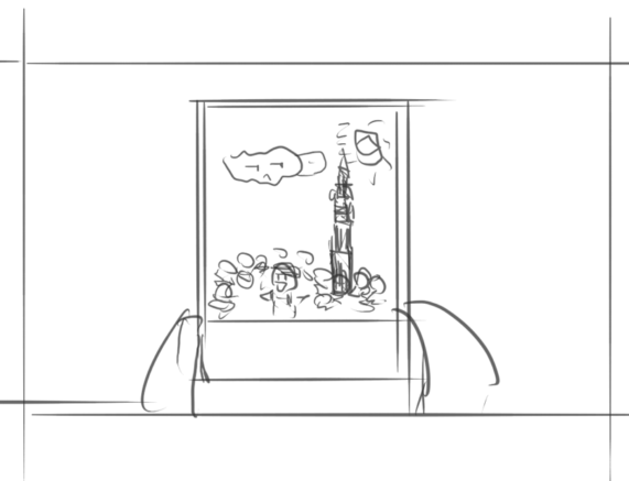
By the end of the day what you get is your selfie with your dream tourism, as well as the crowded people, who have accompany with you for a whole day.
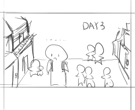
You start being homesick when walking alone at the street. The time difference makes you feel more lonely because everyone you talk with is asleep. Being embraced by the strange culture you start doubting if it’s worth to make this trip.
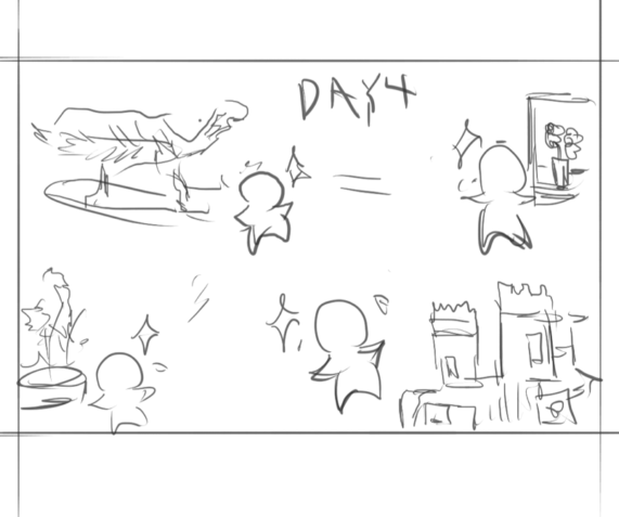
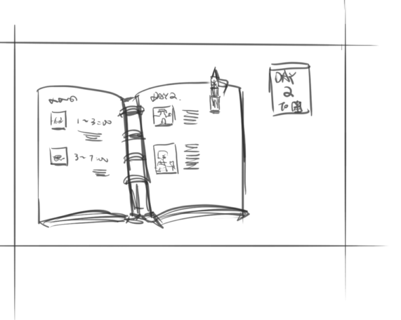
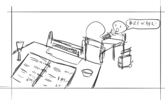
In the next days your plan is really filled up. At some point you really want to have more time for sightseeing but because you have already get your plan and all the tickets, you have to rush.
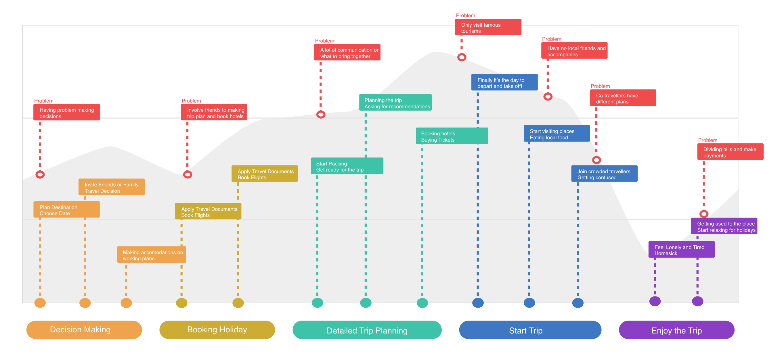
To sum up the travelling experience, the highest emotion point appears at trip planning and taking off instead of real travelling. It started to recover after getting used o local life and started enjoying the holiday. However, we hope in the ideal user journey, the great experience should appear all the way through the trip. Trip planning is also an opportunity that could be optimized and streamlined.
It’s hard to define what a “local life” is. Most of people , whatever city you are in, are experiencing the similar daily life : get up, work , grocery shopping and cook meals. However, there’s quite a lot of daily routine difference because of culture.For example, people in big cities are used to fast pace life that their night life would be much more busier. Japan has the “midnight dinner” in small restaurant where the cook knows every customer’s preference on food. In contrast, Europe, famous for its slow life pace especially north Europe, would perform the opposite site.
Establishing a platform that everyone could be a traveler while everyone could be a local consultant providing local information for tourists. For tourists, they would have a chance to get contact with a specific local resident that might help him. Local resident would get a chance to gain new friends, and , the more important is , dig those great corners which they missed in their daily life.
Wireframes
The first iteration of wireframe is drawn by hand to basically organize all supposed functions together. Similar functions are combined to one section. Altogether there would be four different sections on the header menu – Front page, Explore, Forum, Search and Profile. The five sections are divided based on the initial concept and drive for the project – “Share” “Explore and Discover”.
Before refinement of the wireframe, there are several criteria settled up according to the product drive and usability standard. Those criteria includes:
- Accessibility of city detail page
- Being able to fully explore a City page
- Clear view of travel plan
- Get recommended information in short time
- Looking for a potential micro interaction design particularly for the user group.
Adding Visual Elements
Color Palette
When Landing on a Detailed Tab Design
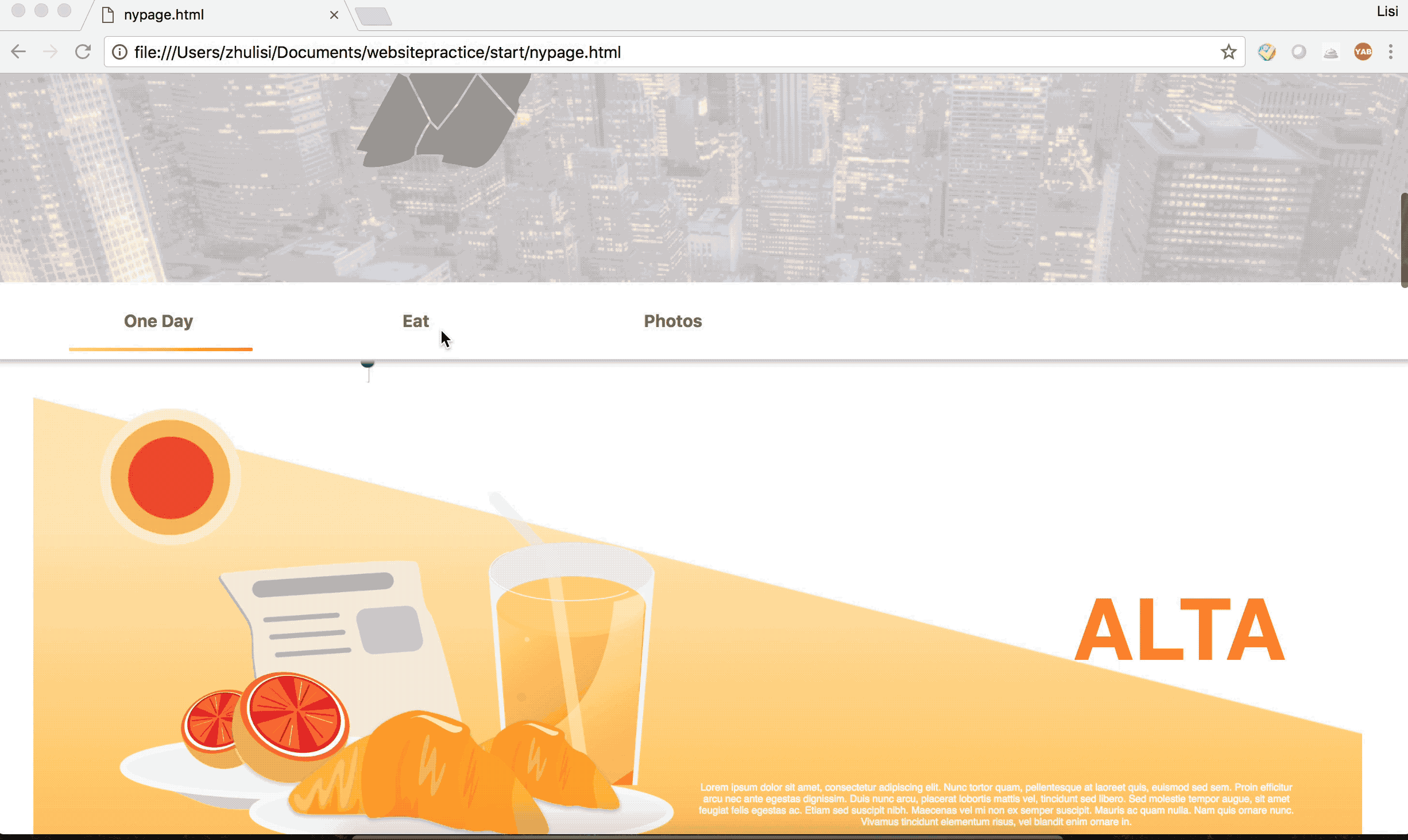
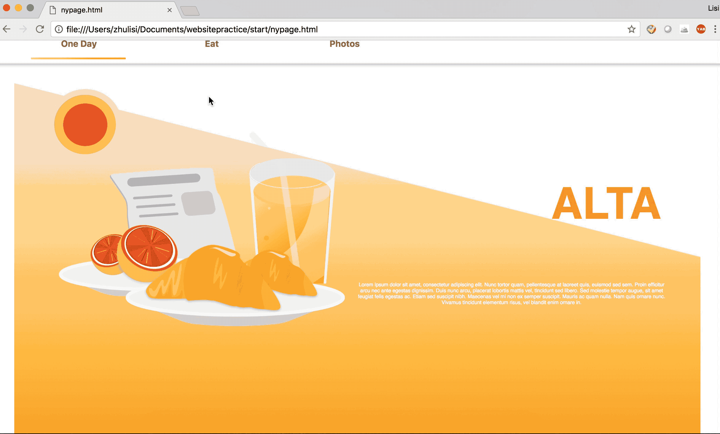
Several different sections of content will be displayed on the website when introducing a city. Typically in traditional travelling websites, there will be famous tourisms recommended. In this new website, in order to introduce the local life, I designed three different blocks to show what’s appealing in the city. A very common design question came to me at this point. How should I design the tab?
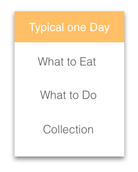
Option 1
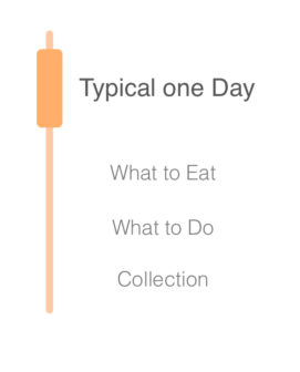
Option 2
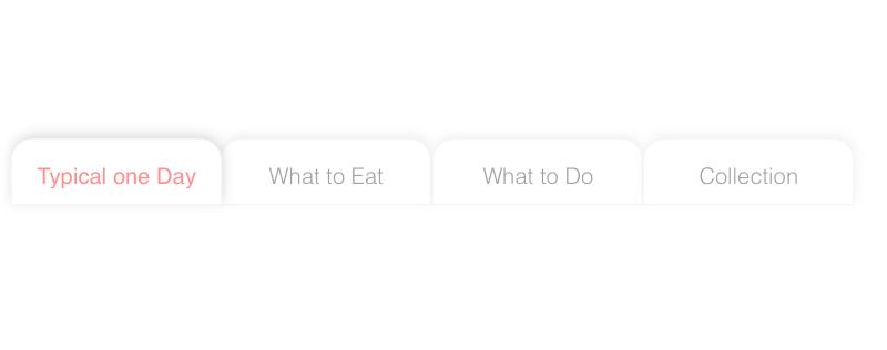
Option 3
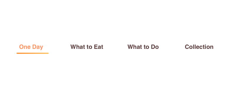
Option 4
Everytime when there’s a small design feature that needs to land on, i prefer providing multiple different options and came up with a decision with the help of a quick user test. Due to the limitation of time and budget, I invited several designer friends to my test. There are advantages when talking with designers because they can evaluate the design from ux’s perspective. However, it would be hard to examine coding difficulty or business performance without other backgrounds’ friends’ input.
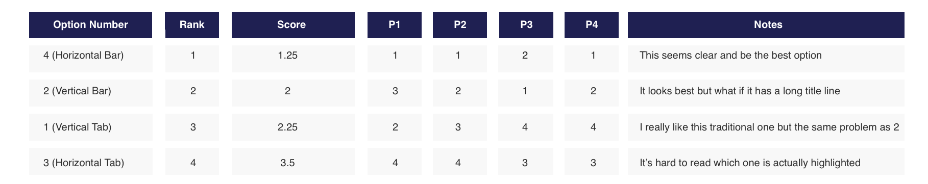
Participants had quite similar opinions towards the visual style which is a “non-tab look like” tab. We had a long discussion on using a vertical one or a horizontal one. The vertical one is more compatible with web-based design guideline because it’s not interrupting users’ reading sequence. It’s easier to code as well because it would be a single page context. However, considering the future functions that might be added to the sections and the length of titles, horizontal options are more friendly for future development.
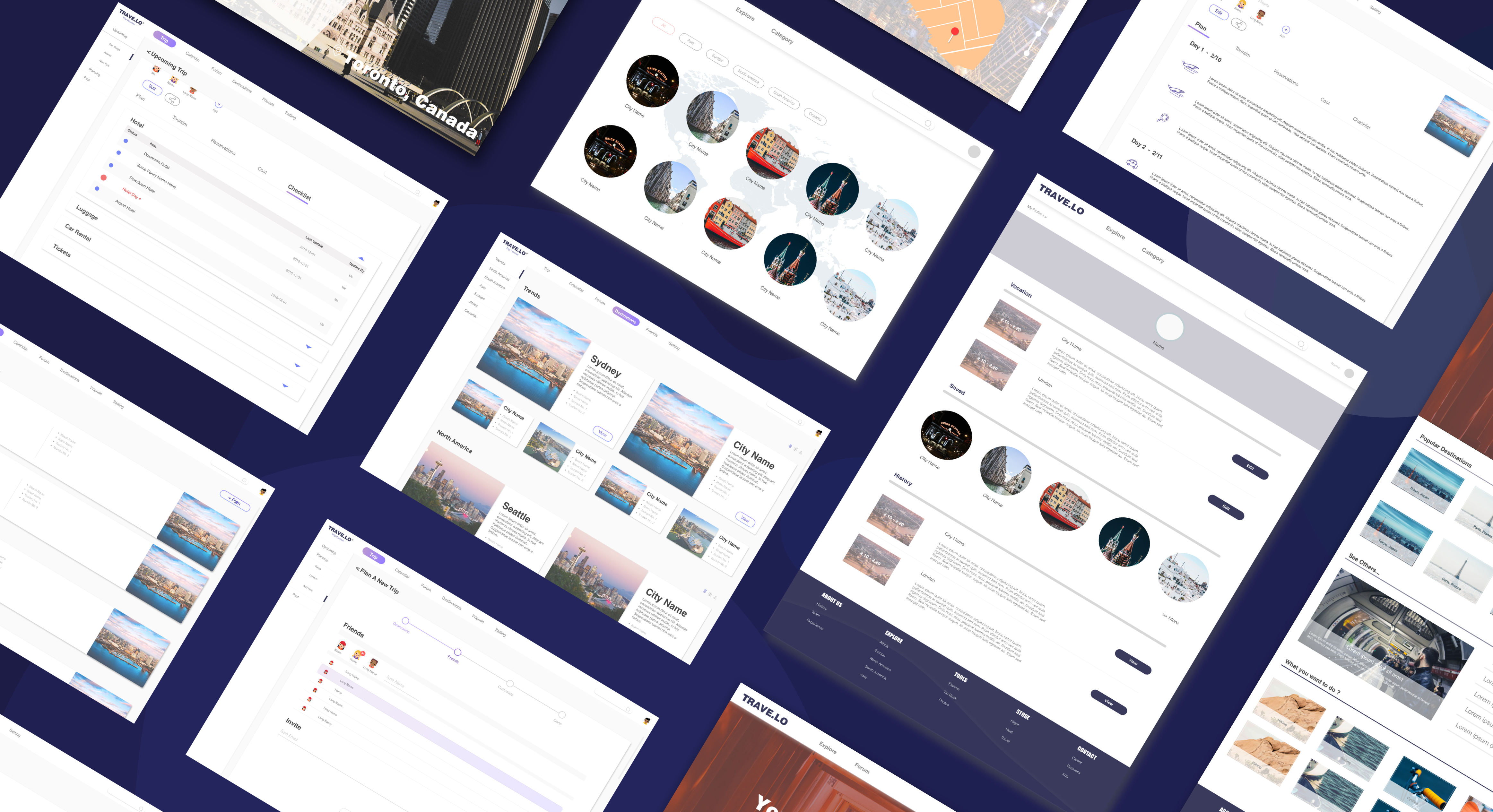
Prototype
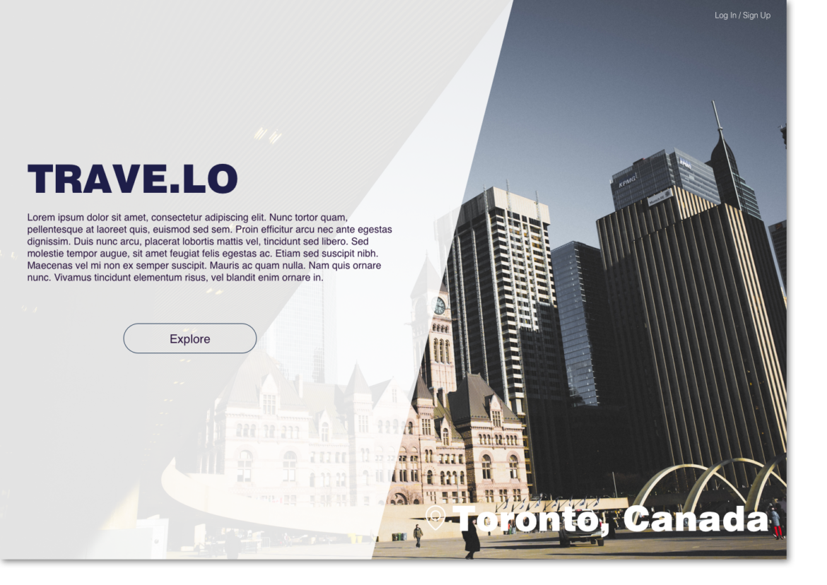
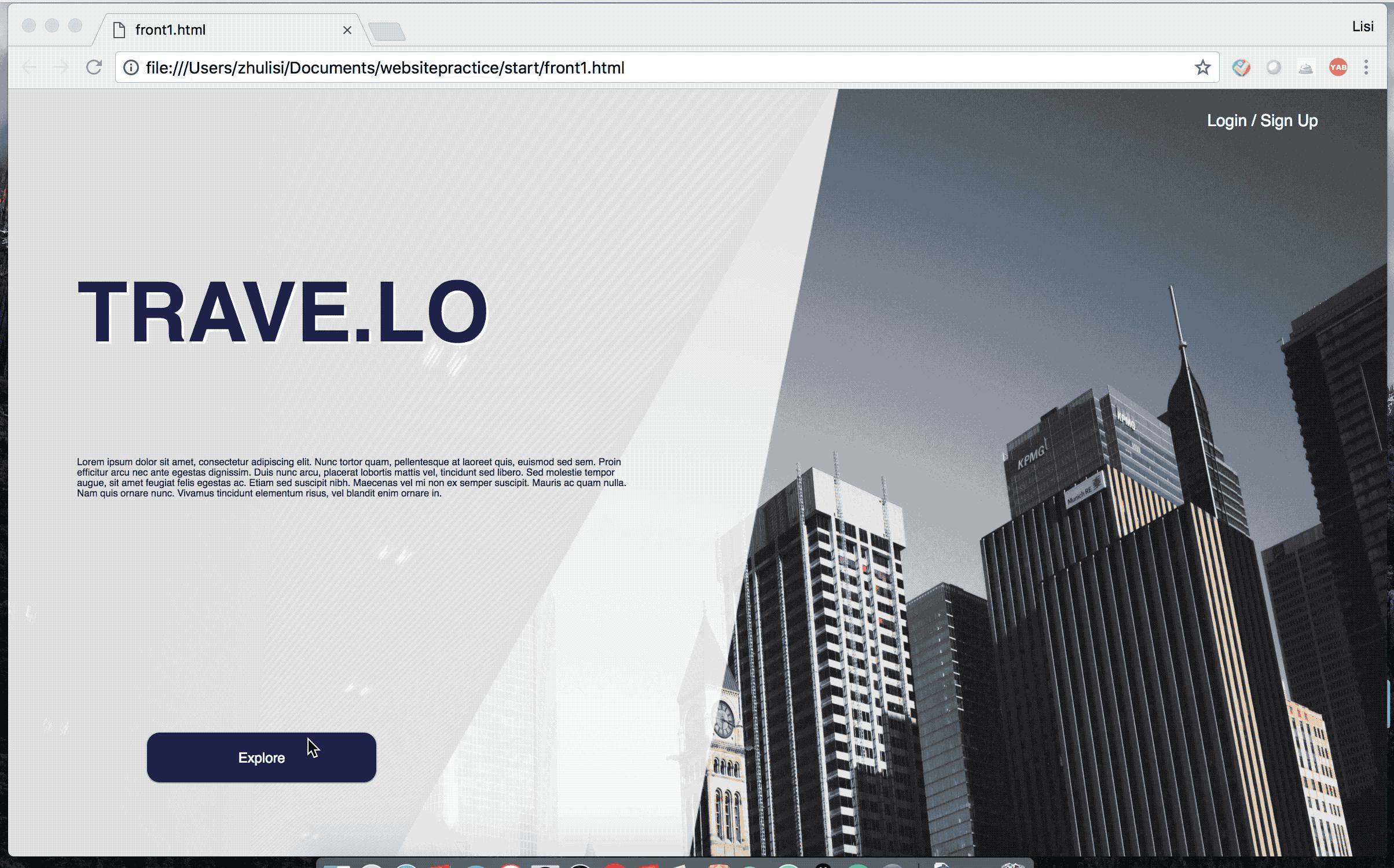
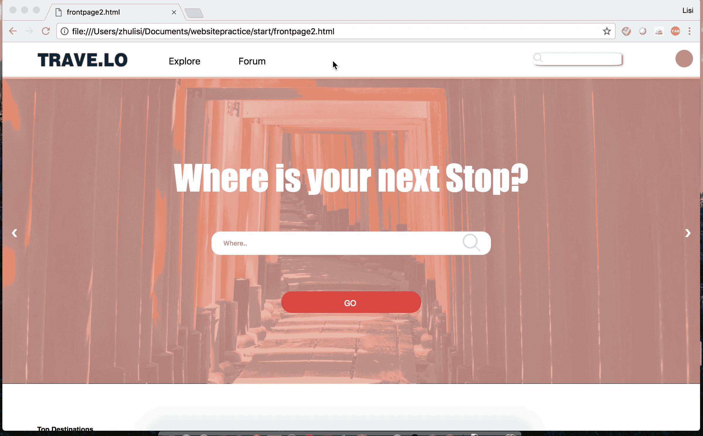
Welcome page
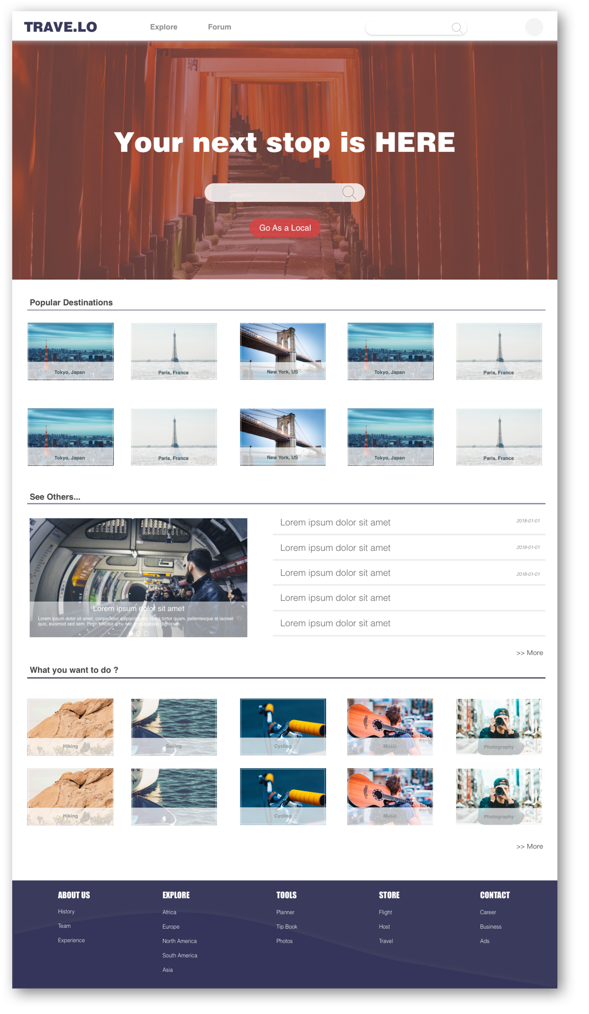
When visiting the website, the welcome page would display a grand shot of popular city and simple description about the website. Visitor could choose to visit as a guest or sign in.
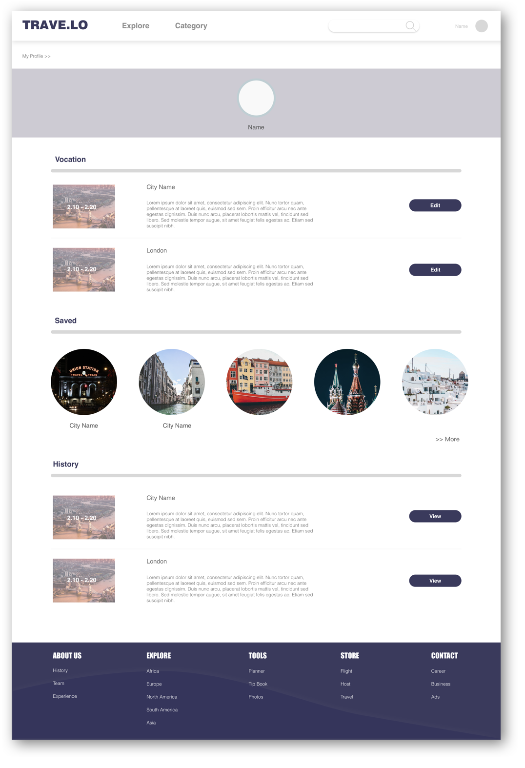
My profile
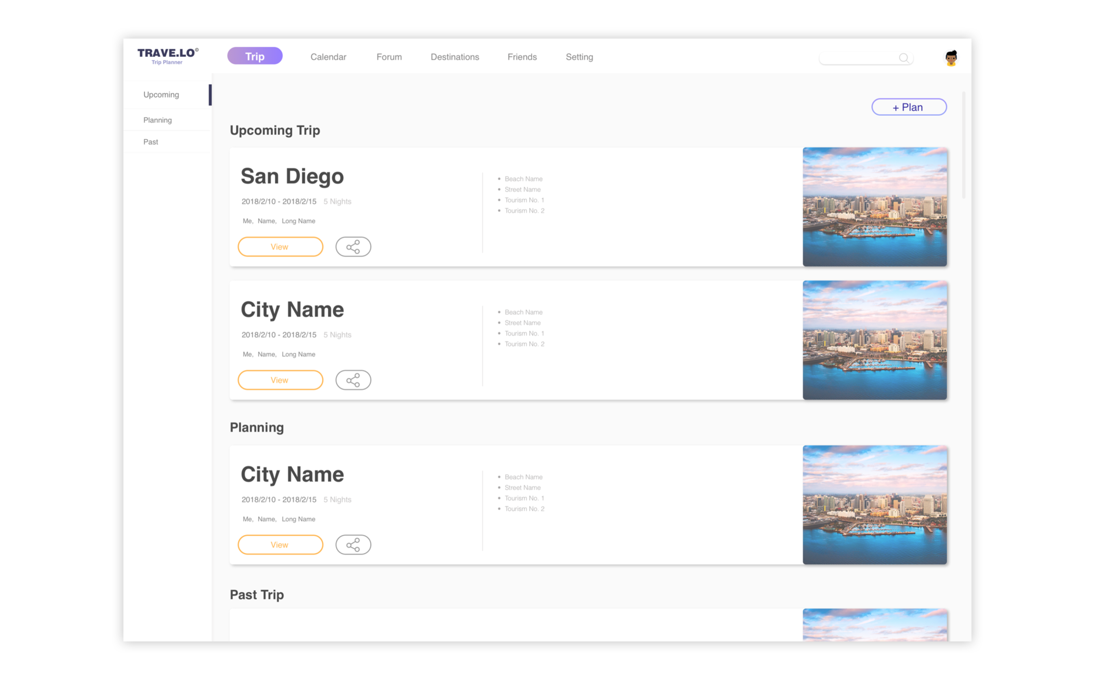
In the profile page, users can view cities and journeys that they have saved or liked. They will see their own journey and post too.
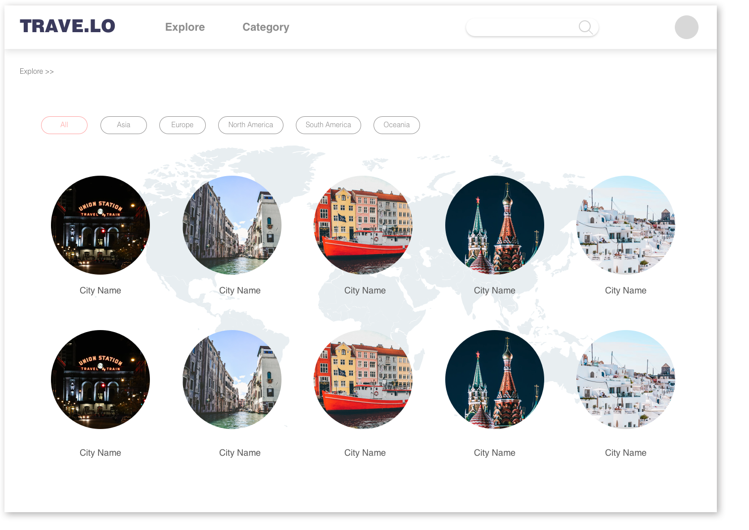
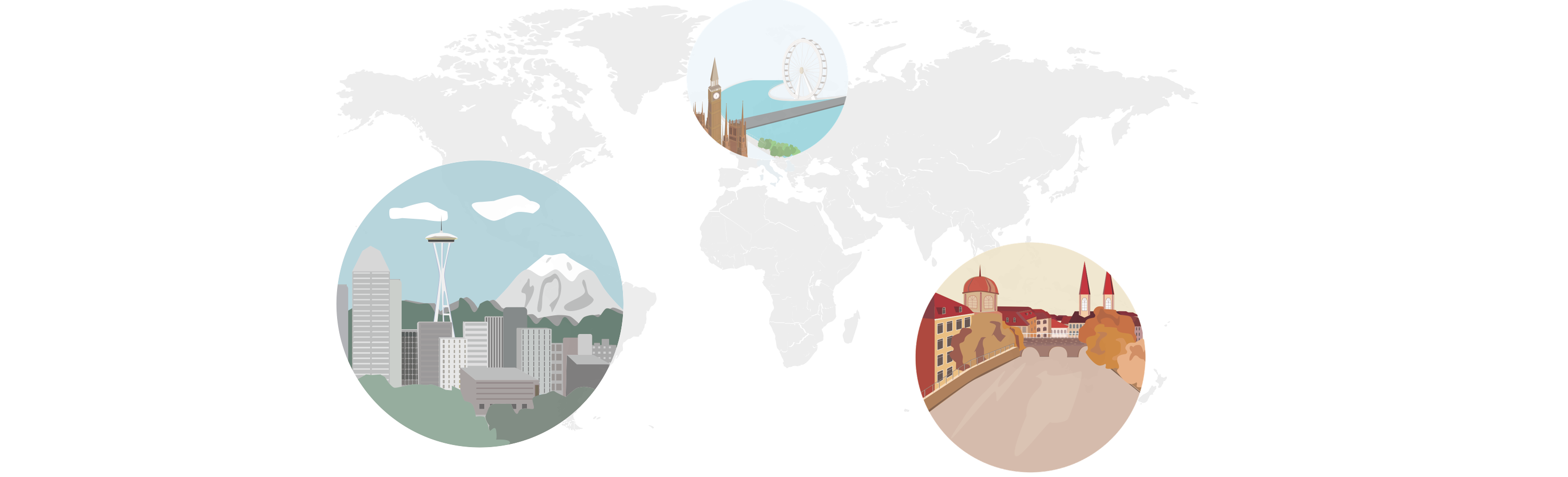
Explore
The explore page is designed to display popular destinations in different continents. When users are just wandering randomly instead of really looking for a certain place, they could visit this page finding their interested place. The aim is to leave impression of different cities ,which may inspire users when they plan for their next vacation.
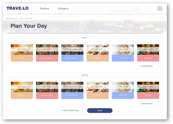
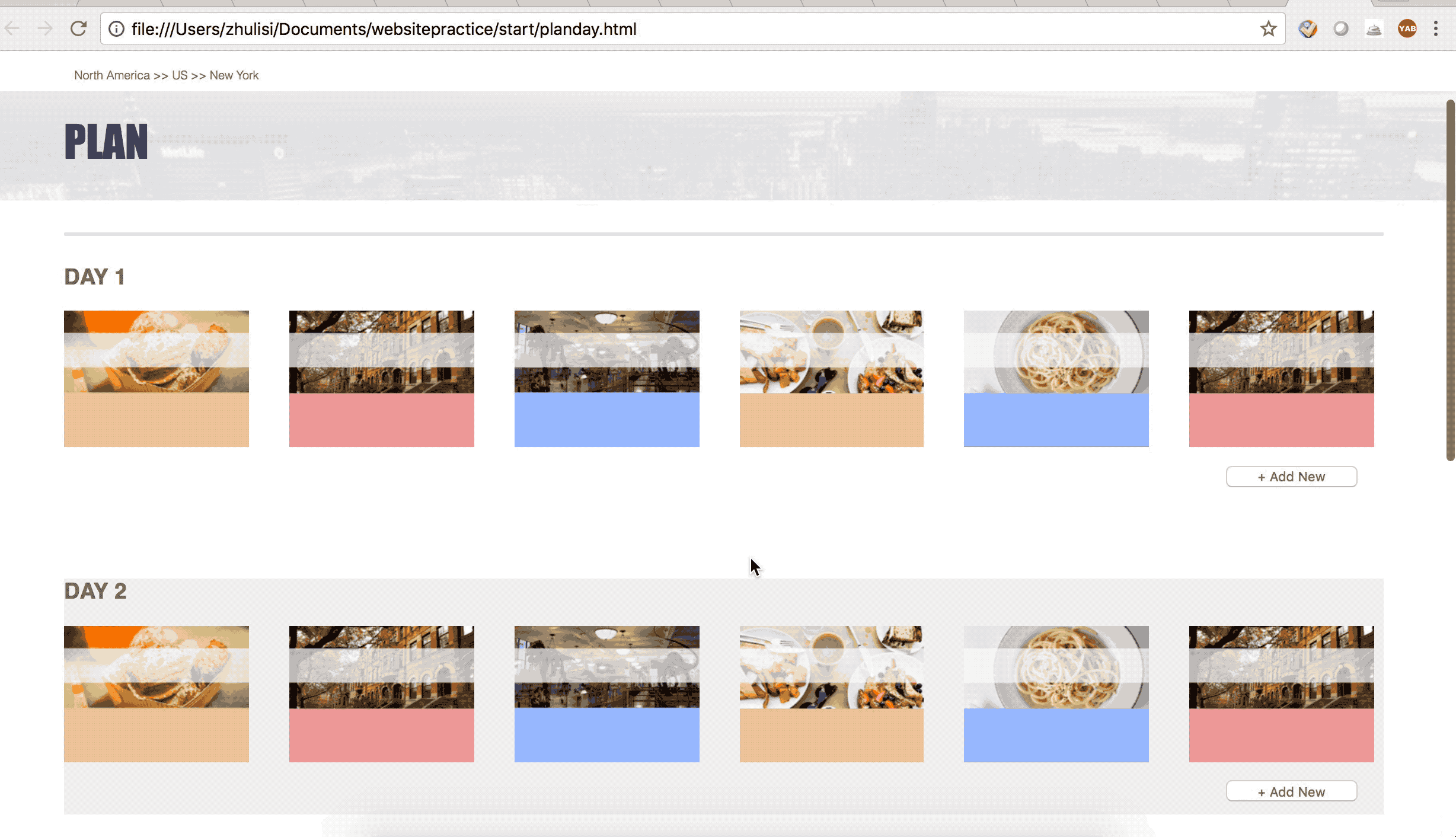
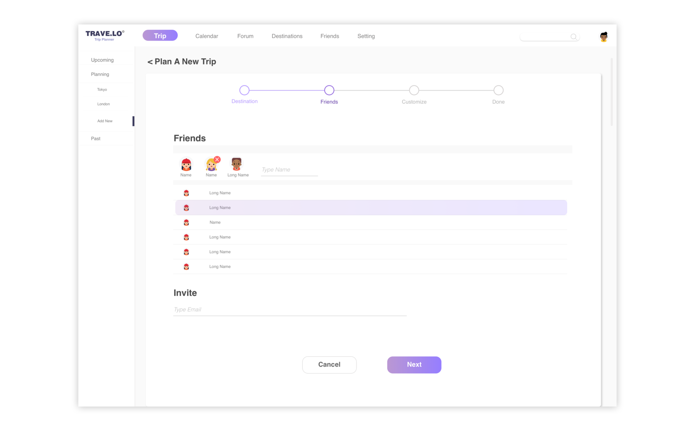
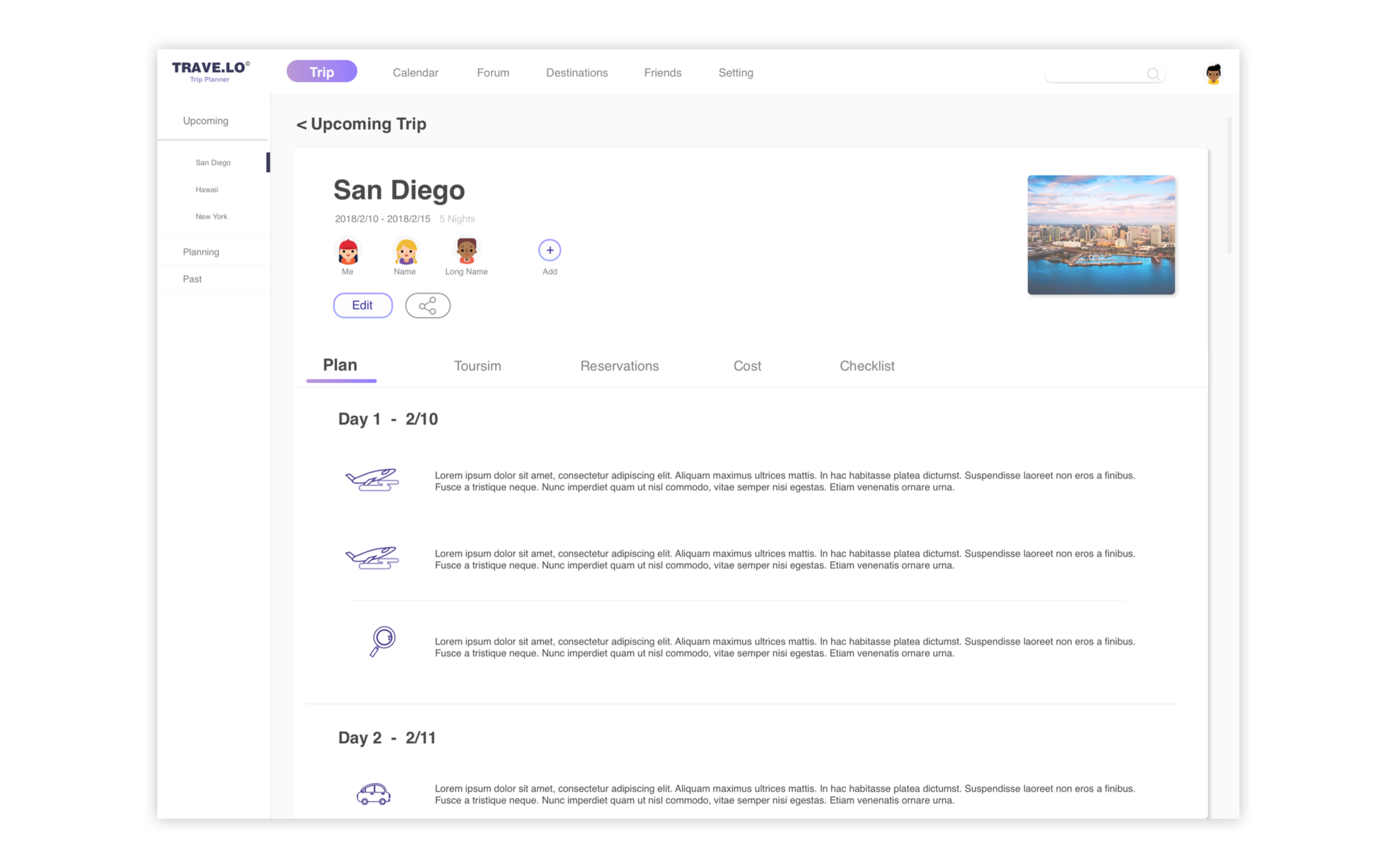
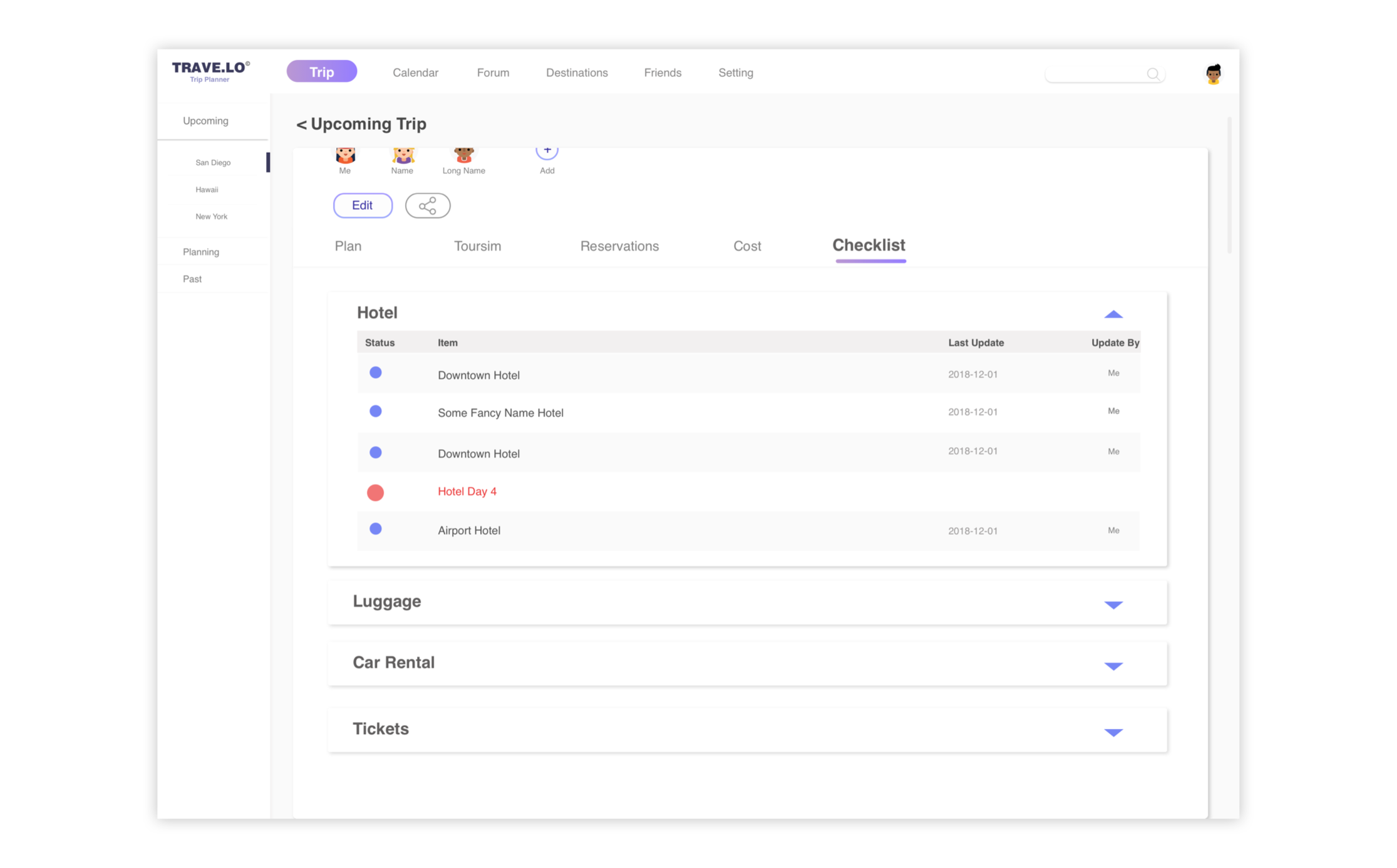
Planner
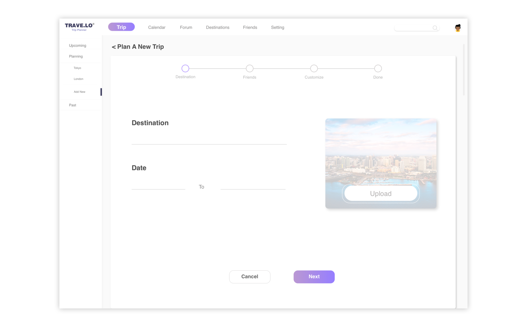
The planner tool allows all users to check and share their travel plan easily. The planner is designed as a modular section that users can drag, delete and edit the plan. Unifying all travel plans could also make reading process easier for both travelers and local residence. Locals will be able to review all visitor’s plan and make comments.
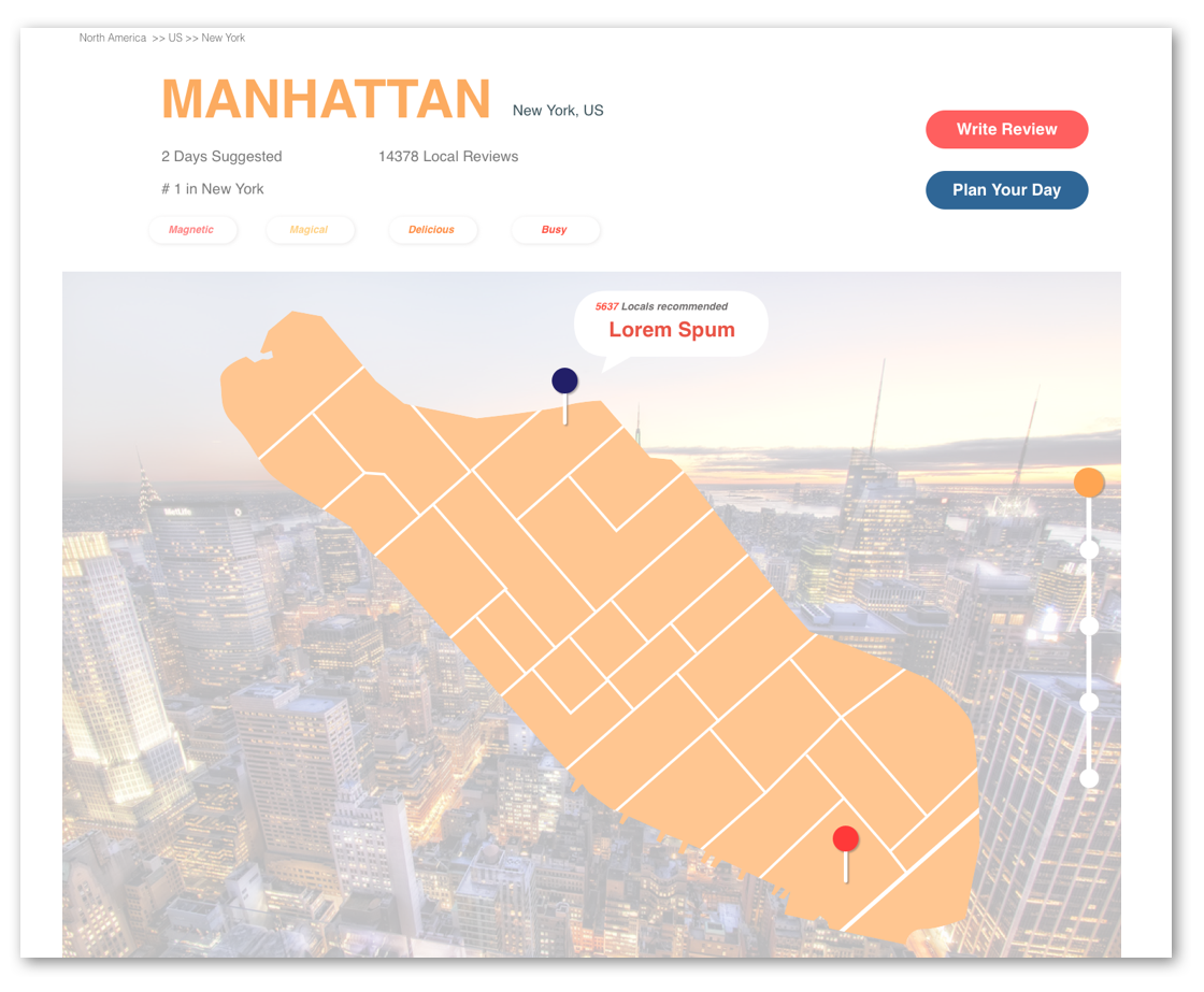
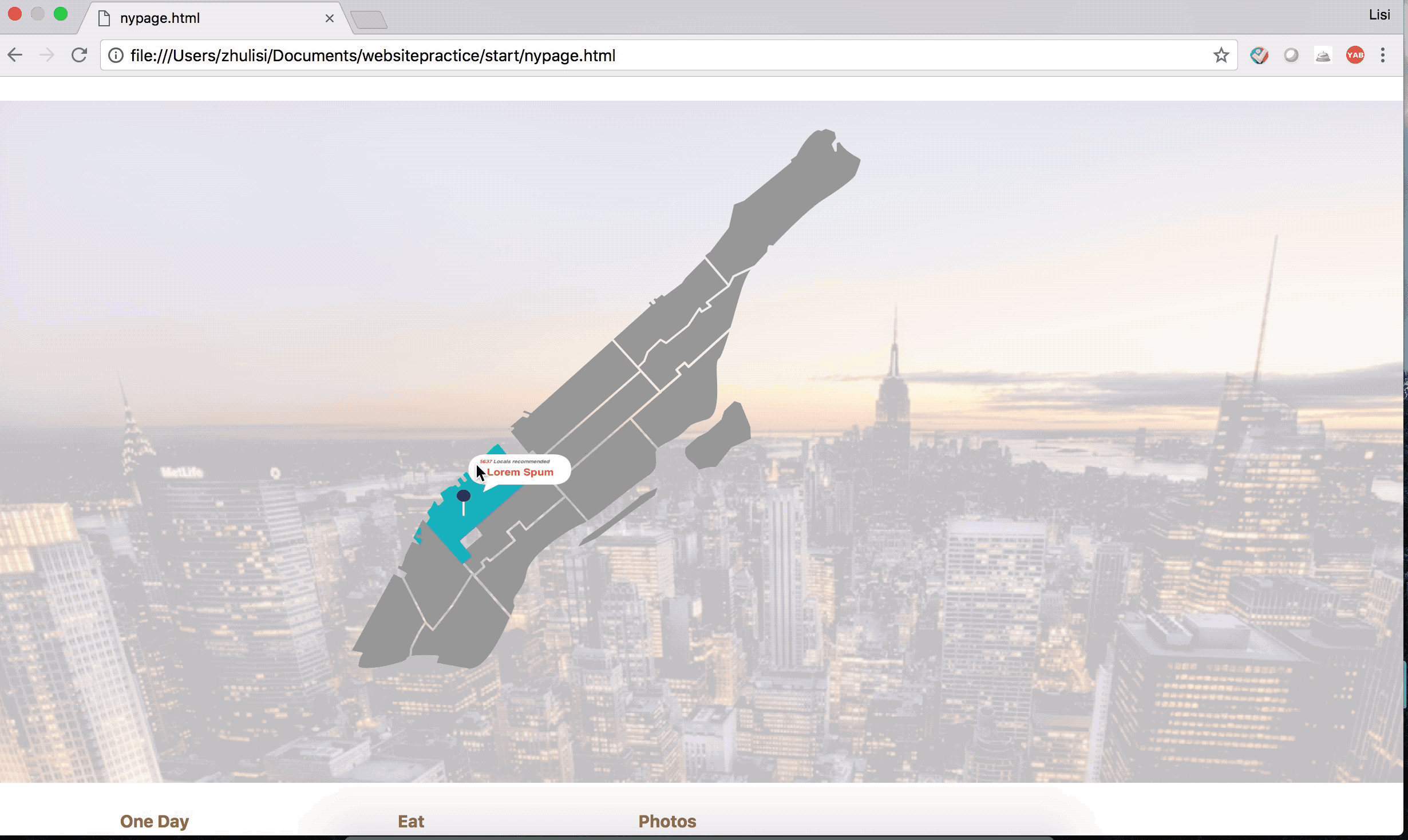
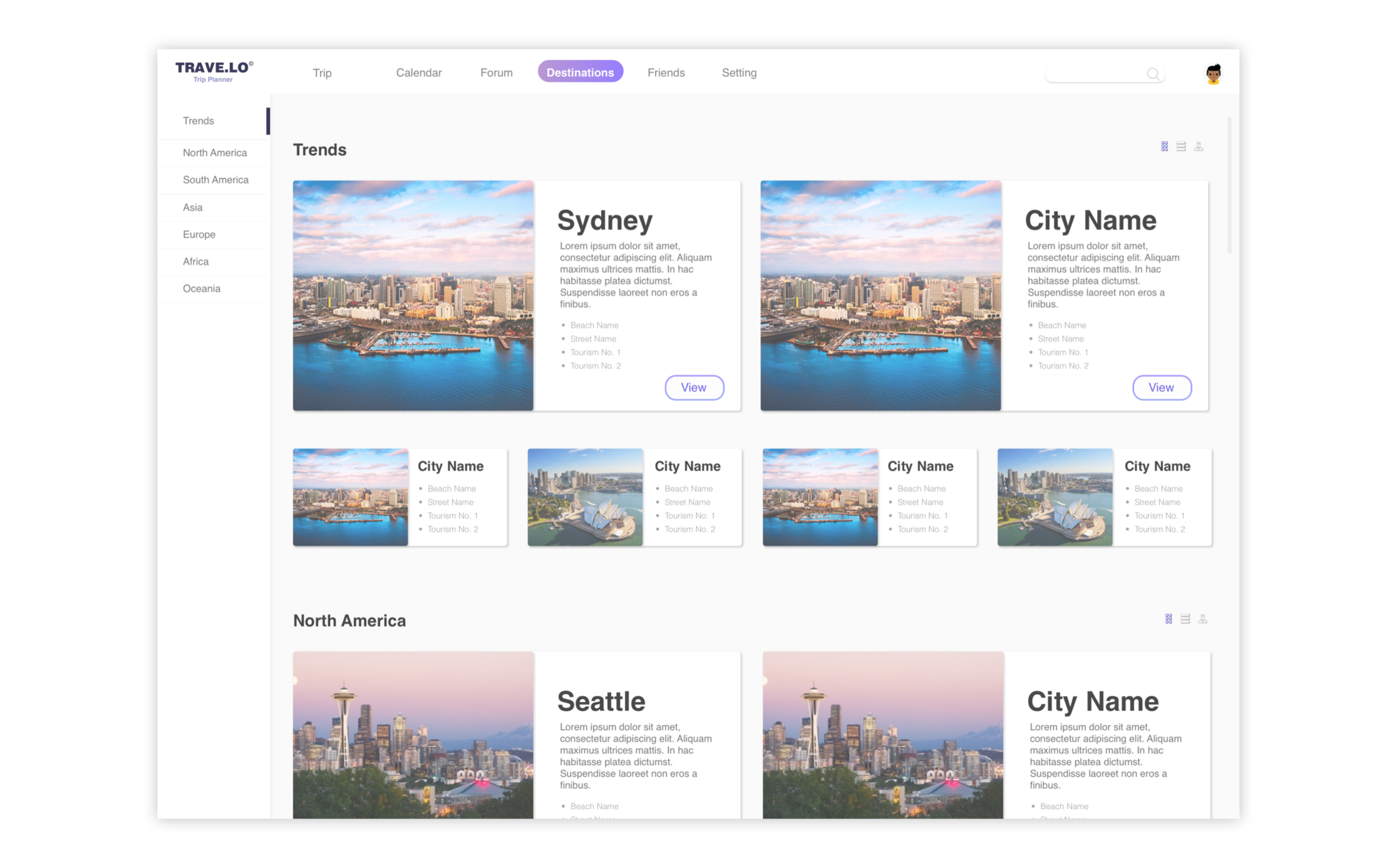
City
On the top of city’s page there would be city name and city location displayed as title. Several index and ranking would be displayed following the name while two buttons leading users to review and journey planning sitting on the right. Following them is the city’s main map which is interactive. When users move their mouse, they would see the popular destinations or place to go in the pointed area.
Front Page
Once the user started exploring the website, the front page includes popular destinations, popular journey plans shared by other users.
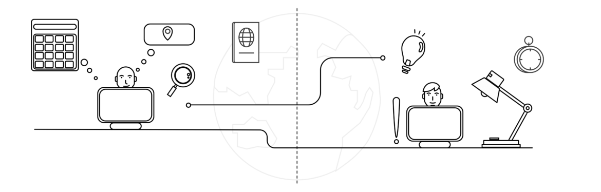
Optimizing Trip Planning Experience
While working on the project, the main challenge for me is to put all the functions in a website especially for the journey planning part. There are a lot of elements involved in the journey planning phase. A single page may not be the perfect solution for journey planning.
Instead of making it a simple website, I started developing a web-based experience for journey planning.
Reflection
The initial motivation of this project started with countless complain from friends – “I followed some tips and recommendations from travel forum and found that place is full of travelers”. As a practice project for prototype coding, the time consumed to build this project is a bit longer than imagine while learning new skills. Due to time limitation not all of the pages and functions is included – Would like to keep improving and updating it in the future! As becoming more and more familiar with coding language my efficient could be much higher.