
RECPTS
PAPERLESS RECEIPTS SCAN AND MANAGEMENT
Individual Project | 4 weeks | Spring 2018
RESEARCH
VISUALIZATION
PROTOTYPE
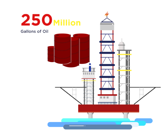
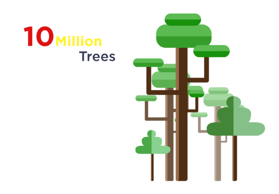
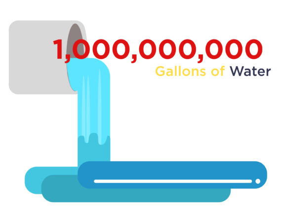
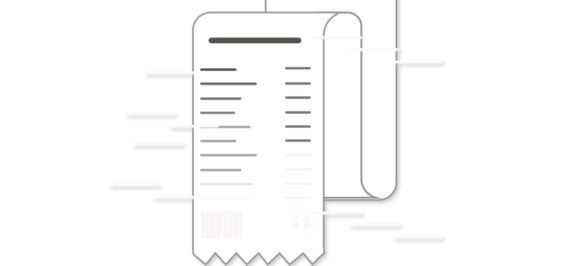
Let’s start with some Data.
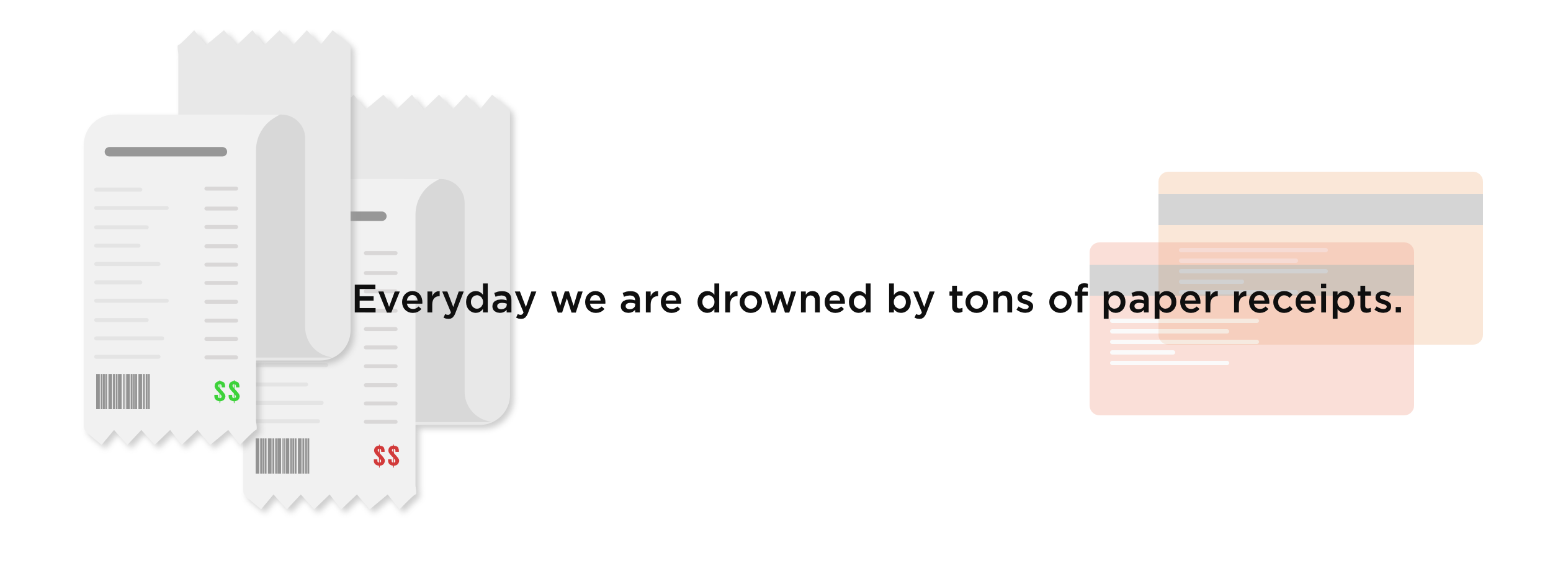
We’ve noticed the issue! What are we doing now?
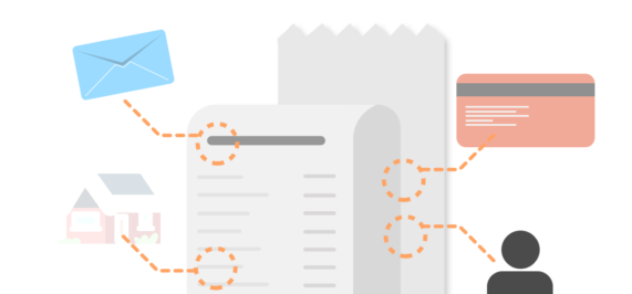
As the wasting resource issue is growing more seriously every year, several industries have launched multiple policies to help reducing production of unnecessary receipts. Being created along with digital wallet, digital receipts are considered to be the most likely future replacement of paper receipts.
The project’s goal was to design a mobile based platform for users to receive, keep and manage all their receipts. Before starting designing, a current solution map was created based on marketing research on popular replacement of paper receipts as well as users’ feedback on existed solutions.
Business Receipt Regulation System
For business intend, receipts apps are designed to ease the process of reimbursement.
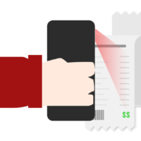
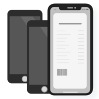
Receipt Scanning
Receipts scanning technology has been well-developed to import paper based receipts to your device.

Email Receipt
Department stores start providing receipts by email to customers.
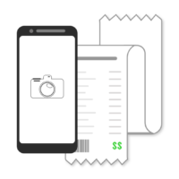
Take a Photo
Or you can try the basic way —— Take a photo of your receipt and keep it in album.
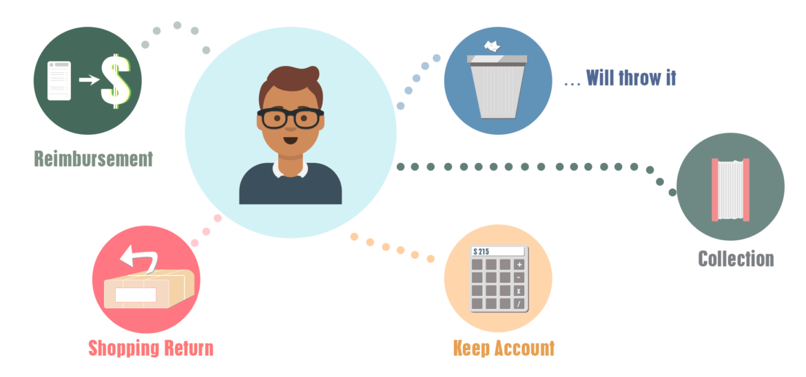
What do users do with their receipts?
Knowing a bit more about the users
Before we design the App ,We need to know why the users want to keep the receipts for and usually how they would keep their receipts right now.
The reason of most users keeping their receipts is just in case they are not satisfied with the products. They are categorized as the typical user group – receipts are regarded as a proof of purchasement, which is same as those who keep receipts for reimbursement. After several days of usage, the receipts are usually thrown away.
Users with a good habit of keeping account will collect receipts for daily accounting and recording. They are categorized as the potential user group. Once those user get their receipts, they will keep it in a folder, or will type the information into digital document and throw away.
We would like to streamlining the process for purchasing, payment and getting the receipt. What if the payment process could be conducted at the same time as receipting process?
One advantage of using mobile phone as a platform is the “seamless purchasing process”. With the implement of apple pay, alipay, venom etc, increasingly users are saying bye to physical wallet. In future, after purchasing products from store, users only need to scan the code for payment and receive the receipt at the same time when money goes away.
Start with the Problems
Design a full process sounds a huge task so I chose to break it down to frequently mentioned problems by participants of my interview. The amazing thing about receipts are that those are all really small, subtle problems that’s not going to affect your life significantly, but will significantly improve your experience when they are solved.
Can’t find receipts when return / repair an item
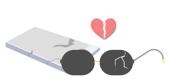
One of the most frustration thing is that when something break, it’s sad but it’s worse if receipt is lost so that there’s no coverage on repairment or lost. Especially when it comes to an expensive or luxury item.
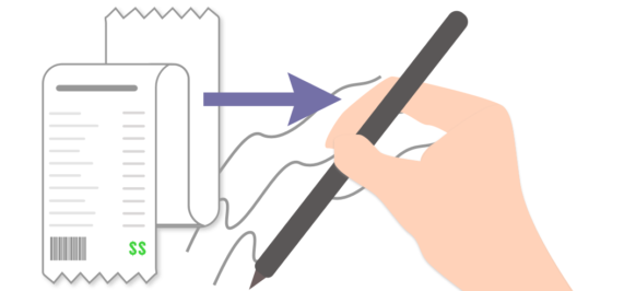
Hard to keep account
Paper receipts are so hard to keep account and keep record how much money the user has pent in that month. In some cases users need to copy and write down each item they bought, which cost a long time.
Text fading away
Text will faded very easily after 1 months on most of paper receipts especially when it’s humid. It will be harder for people who want to get a reimbursement after the project, or till the end of the year.
Information Privacy
Most of receipts contain private information including card number, payment amount and location, card holder’s name. Not treating it properly after discarding will bring troubles to the users.
As a designer I love problems. They help me define the content of product more thoroughly and help me validate the design direction. After user interviews, the final deliverable of this product will be a digital platform that can mainly collect and manage receipts, with other functions including keeping account, quality assurance and reimbursement.
Using Design to Solve Problems
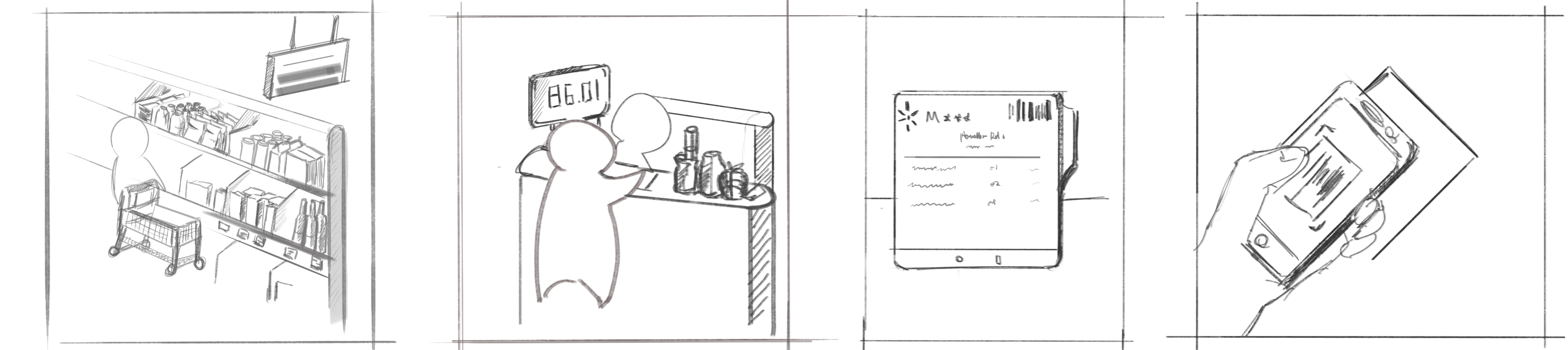
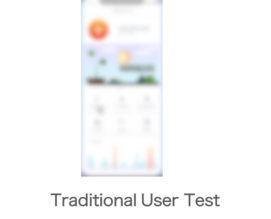
Let’s draw our usage process!
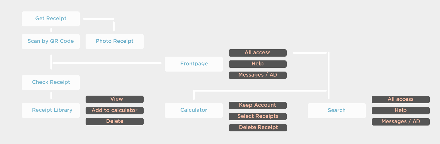
Based on users’ needs, the most important function of this app is to record and calculate. User of this app will experience a “scan/take photo” ->”view” -> “search” process. The simple process could provide most of function users need.
GUIDELINES
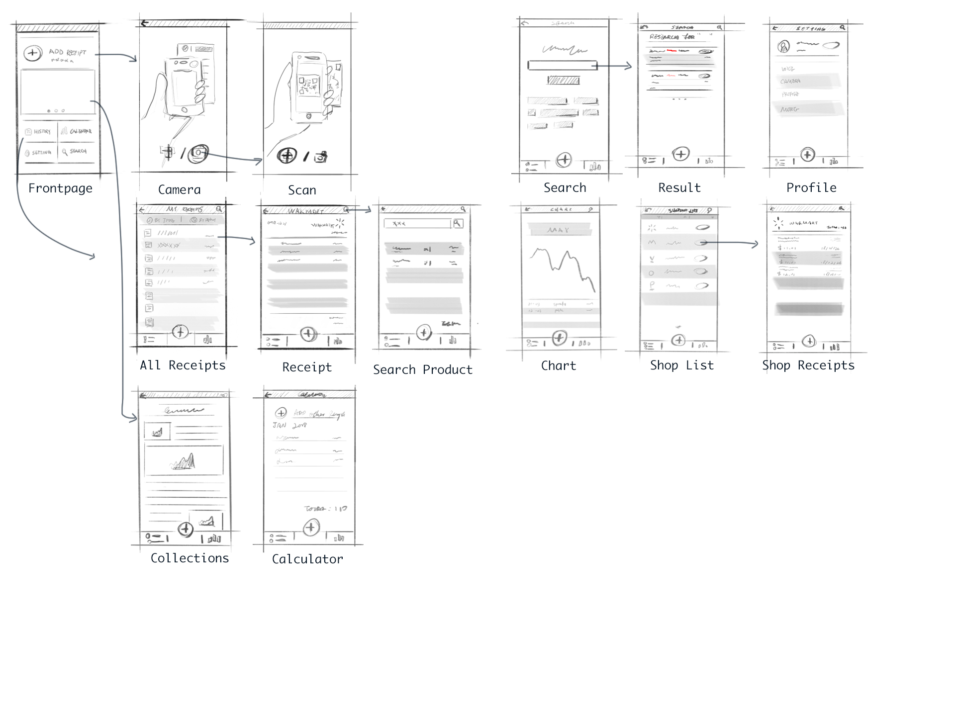
Simple wireframe sketching are done for further revisement and conducting user testing . Upon the previous function list, basically it was grouping and putting multiple functions into one page. Functions and information are organized and displayed in a single page according to importance hierarchy.
Next step is our Graphic guideline.
“Secure, Affordable, Financial” are the three key words of the project theme. In color theory, the corresponding color of secure is blue. In contrast, Orange here is used as highlight color. The combo of blue and orange is also widely used in bank industry as well being a financial related color combination.

I have a lot of choices at this time point actually. Involving users in the early stage is always my preference because changing frames at final stages at a project is always the worst thing to do.
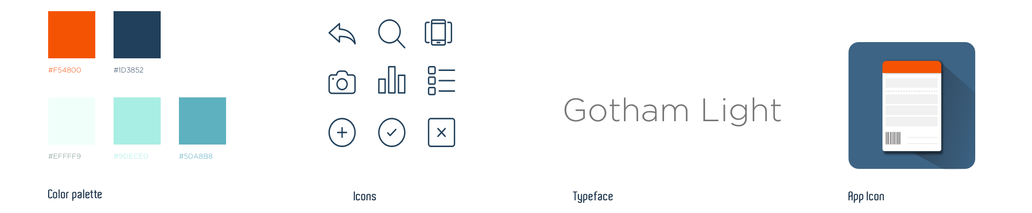
Considering time limitation and insisting that users need to be involved during the first round test, I chose to conduct a simple and quick mvp test with the minimal visualization and details. The main goal is to test if the information architecture is working, if the navigation system is good enough and if it’s too much information for users to accept.
1st Iteration MVP Testing
1st Round User Test
The first round user testing aims at finding issues with information display, basic navigation and collecting suggestions on visual elements. The test is conducted among 4 objects who are all from Design major to help critique. In the first round iteration, users are required to accomplish 4 actions.
- Browse through the app and see if there would be any obstacle.
- Figure out how to use your camera take a photo.
- Looking for a certain recipe received on January 1.
- Tell the author how many ways they could reach “calculator” page.
Because all of my test users are from design background, we conducted a focus group discussion after testing.
Navigation tab can involve more functions.

Compared to “Calculator”, “Calendar” function is more reasonable.

Consistency should be kept – bottom banner can’t disappear on some of the pages.

Tutorial or instruction needed.
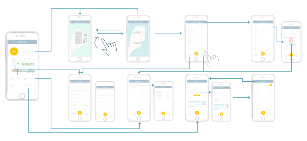
LOG IN
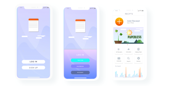
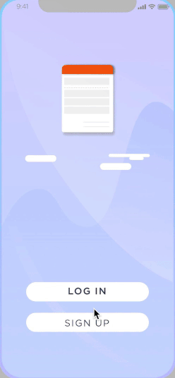
Before start using, users need to set up an account or log in with existed social media account. It avoid data losing when users switch to a new device.
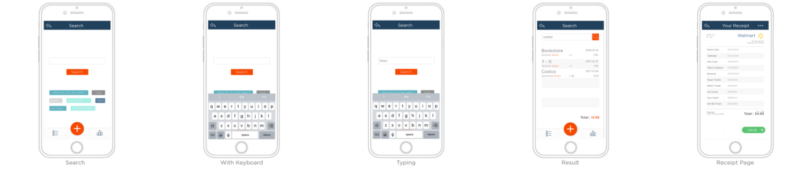
SCAN
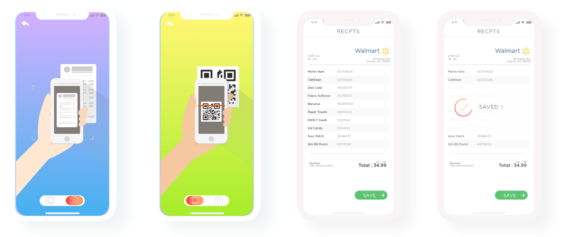
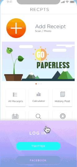
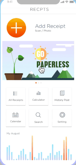
Once logged in, it will automatically lead users to the front page which includes buttons and hot spots to access all functions. The most frequently used function should be adding new receipts which is designed as the primary information displayed on the front page.
Once tapped the add button, it will automatically switch to the scan camera page. Users can switch input mode to “take a photo” by swiping right. There would be a slide at bottom of screen indicating current mode.
The app is compatible with two ways for inputting receipts : Scan the QR code displayed while paying, or, take a photo of receipt displayed on screen and automatically turn it into digital text with text recognition technology.
CALENDAR
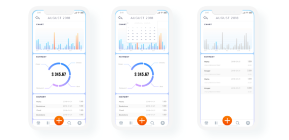
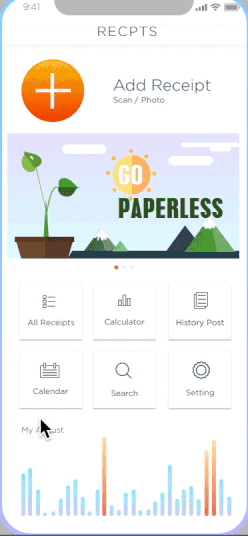
With the advantage of collecting user’s receipts in their daily life, the app provides a calendar function helping users to track their daily expense. It could serve as a account keeper and show user’s expenses record, composition, spend power and trend.
Users can set up an expense alert line in each spending category (for example : grocery, entertainment, academic, etc)and the app could send a reminder when they are close to their spending limitation in certain category.
POST
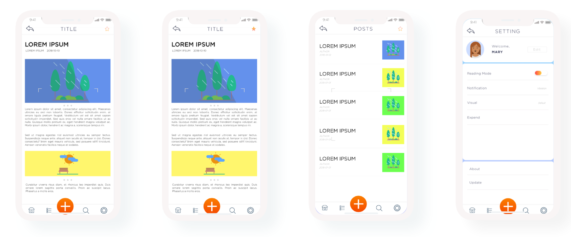
The article section is designed for companies, associated organizations and related business to post promotions, advocations and recent information/update on paperless industries to revoke user’s consciousness of protecting environment as well as build up a eco society.
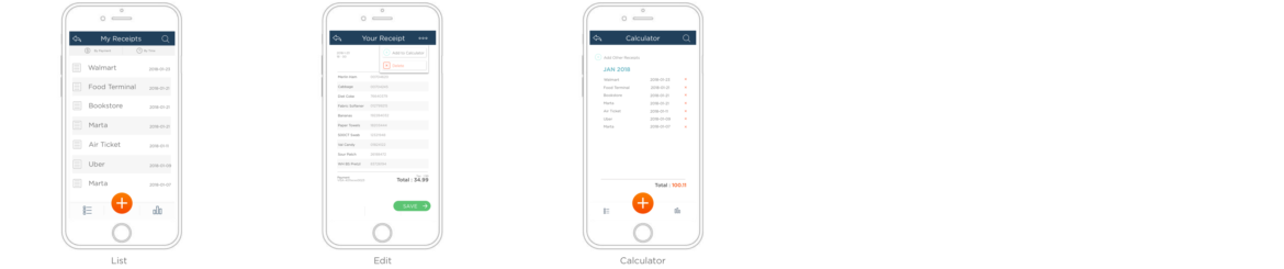
RECEIPTS
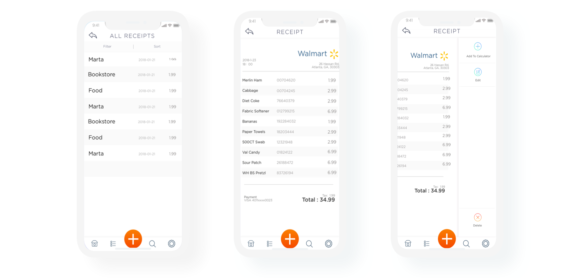
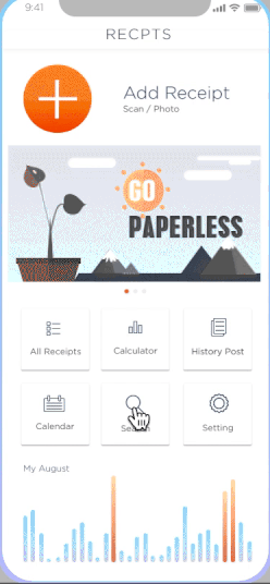
Here is the receipt interface when users would like to check their receipt history. Users are able to check the receipt by date, by business/shops and by keyword research. The receipts could be edited and shared by users.
How those interfaces get connected?
The process is mainly following the routine of “import data, review data, use data”. User are able to switch to receipt library , calculator and search function any time conveniently from icons placed on the bottom tab.
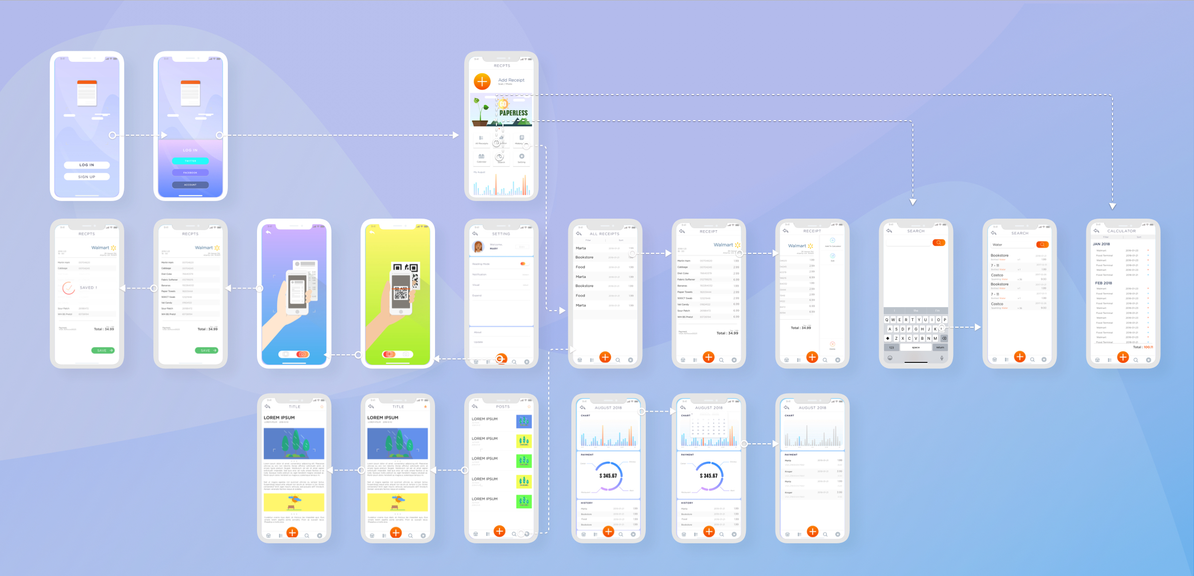
2nd Iteration User Test
User test was conducted on 8/19/2018 with 4 participants with Axure PR preview app on an Iphone device. Users are required to finish 5 tasks and see what obstacle they would meet with.
5 Tasks :
- Scan a receipt.
- Looking for search page
- Add an item from receipt to calculator
- Looking for Saved posts
- Go to Profile Page
Feedback A
- Everything else is good except for when I do something wrong, it would be better if there’s a “feedback” from the app.
Feedback B
- The tab navigation is quite easy.
- The list page could be improved a little bit …Although it’s hard to say where the problem is but it’s not comfortable. It seems be too much information displayed on the page.
Feedback C
- Why the upload button was always on the bottom? It seems a little bit too catchy.
- Prefer to have borders on rectangle.
Feedback D
- Micro-interactions are nice but need a little hints to trigger.
- Because the recipe library serves an important role in the app, it might be a good opportunity to design the filter with a fancy effect.
Wait, there are another group of typical users!
Ideally, the product can face not only personal customers but also business clients especially for reimbursement. The website platform will ensure users can store, management and export those files for further usage. The user story and journey is quite similar as the phone platform but more leaning towards “what’s happening after collecting the receipts”
Web based Receipt Management Platform
The motivation of business customers using this platform is way different from individual customers. We need to think about them as well. Mobile platform is convenient and user-friendly, but in a business scenario, desktop platform is more prevail and acceptable.
In order to further develop more in the desktop platform, some more user research need to be done in order to learn user story context. It was difficult for me to get a real “targeted user” because as a student, I only have limited access to users.
When there’s no access to targeted users, what should I do?

I chose to invite users to a role play game to help them know a bit more about the scenario and content. Before inviting users, I did some desktop research to see who’s our typical user and designed some “character feature” cards for participants. Limited by project schedule (as the desktop platform is already a bonus part for the project), I invited 2 students with quite a lot of internship experience to be the object.
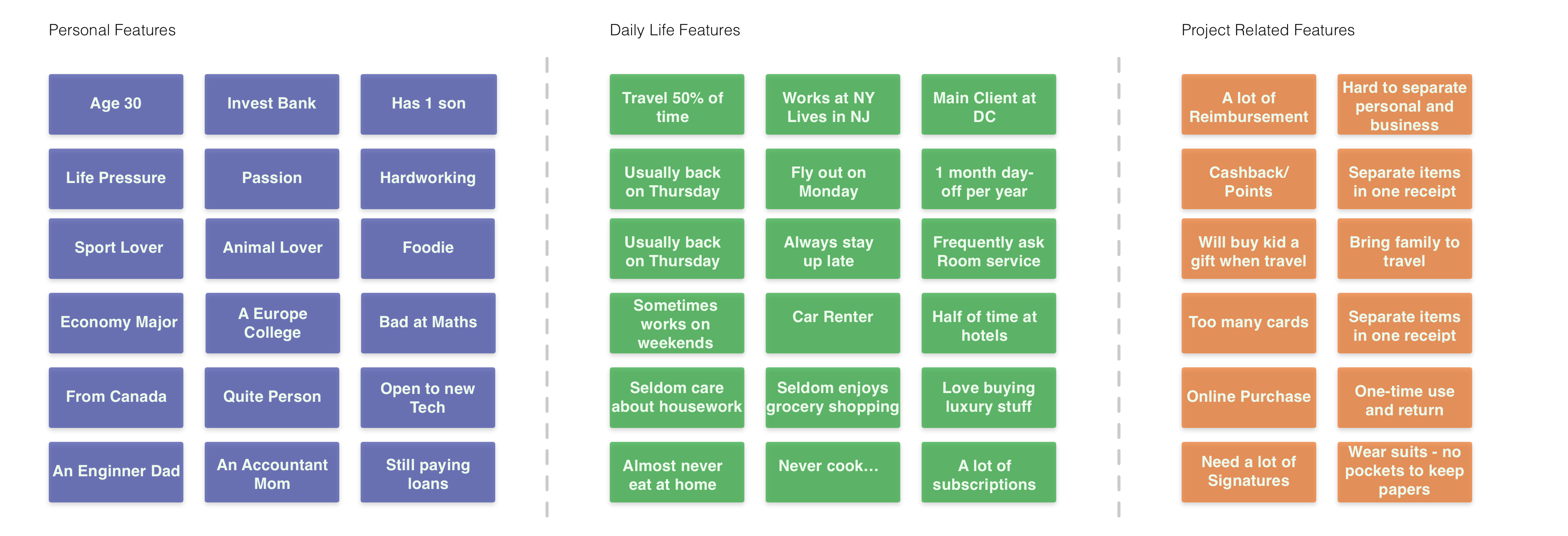
Here is the keywords I provided to the participants. In the “role play game storm”, the two person will play as the business user of our product, and walk through the overall process of arriving at hotel, ordering food from room, and going shopping at stores. After that, participants were invited to use paper cards to design the user flow of management system. In this particular process, two different users are included —— the company and the business people. Two participants were playing those two different roles.
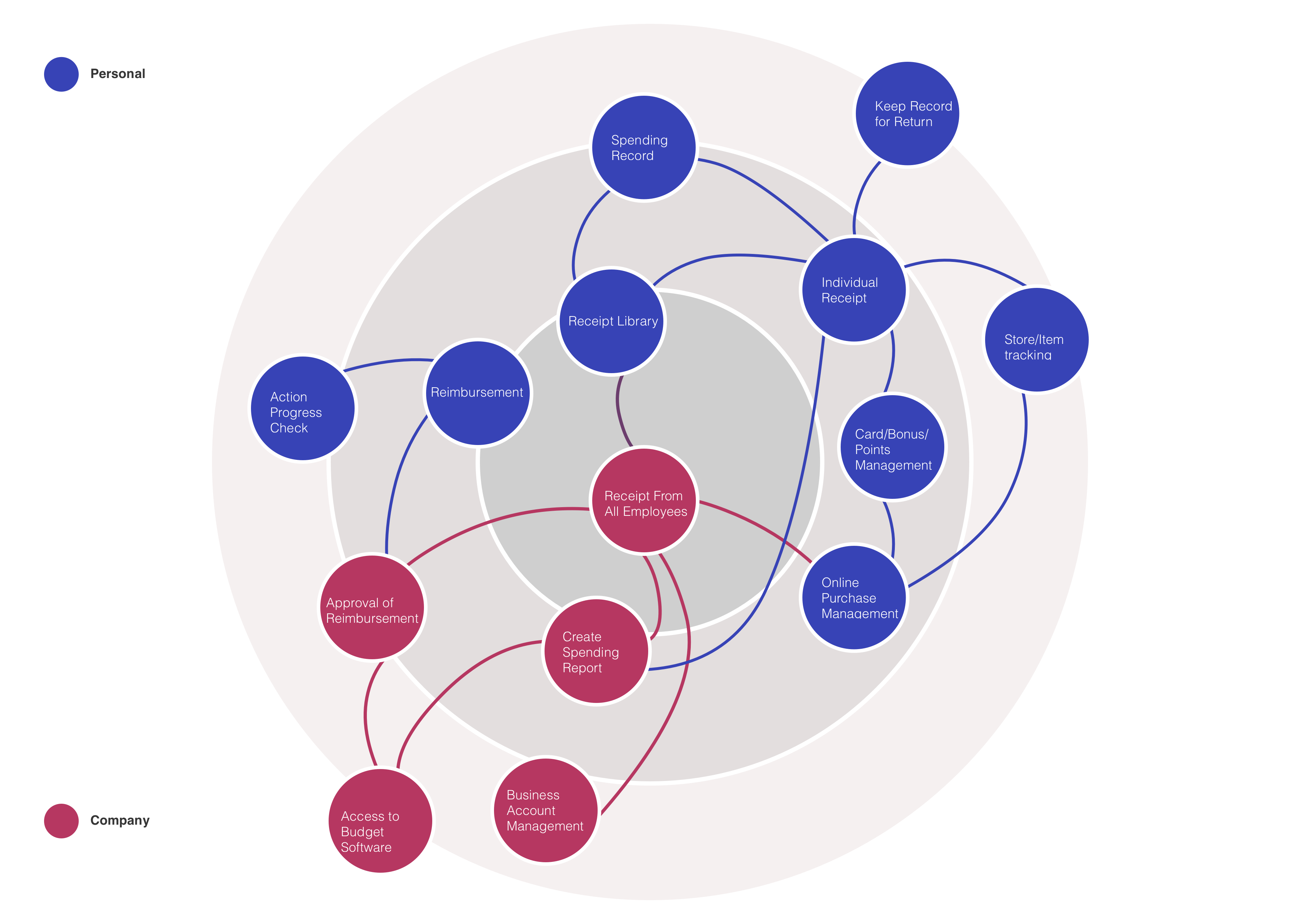
The main difference of desktop business platform and mobile personal platform is the function. With business customers being targeted users, the platform serves more as a management and reimbursement software. So I decided to dig a little bit deeper into the reimbursement process.
User flow could be created based on what information they need to provide and what interaction steps they need to finish.
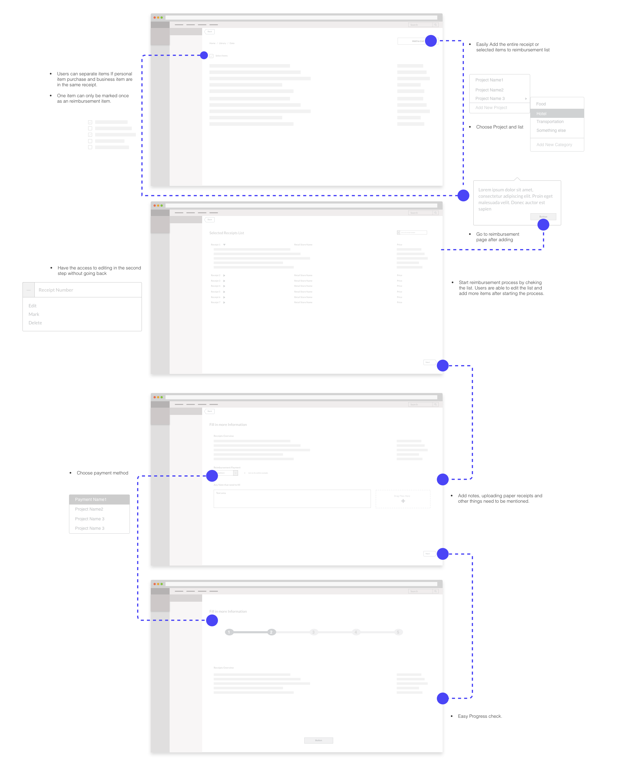
Fill in the visual guide – A Quick Demo
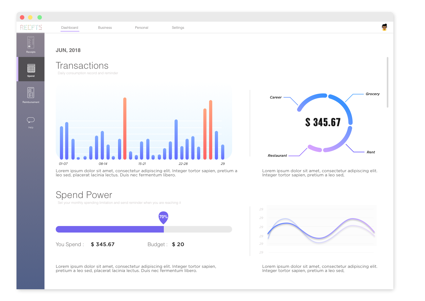
As the quick demo shows, the product can help users manage and check their receipts on desktop platform quite easily and show their spending record by months.
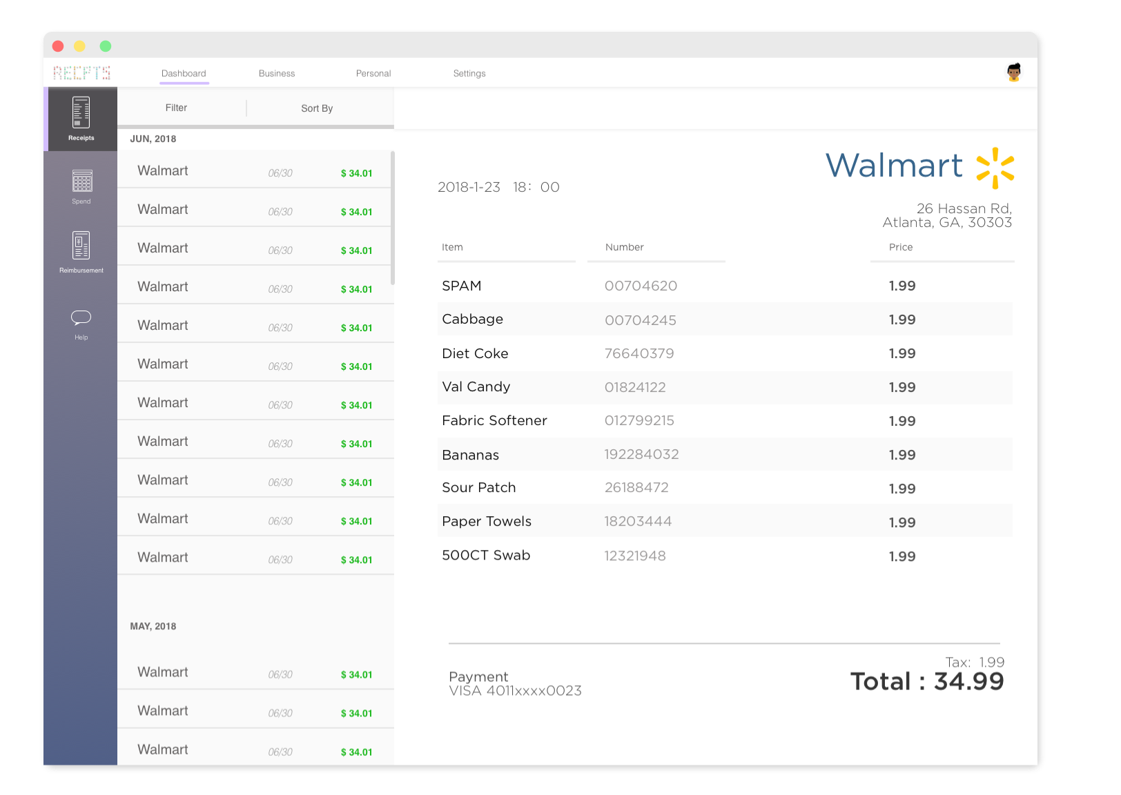
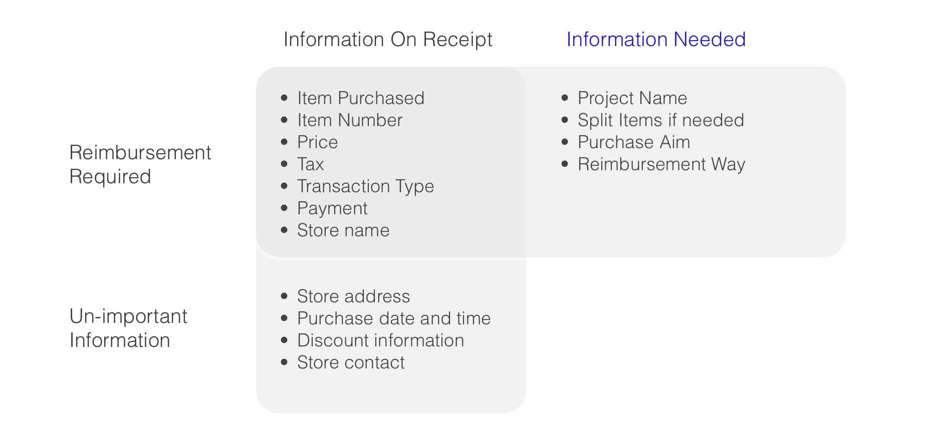
Users can check their receipts which include item name, number, price, retail store, address, time, payment method information. This can not only help users build their receipt library but also help them to regulate spending record.
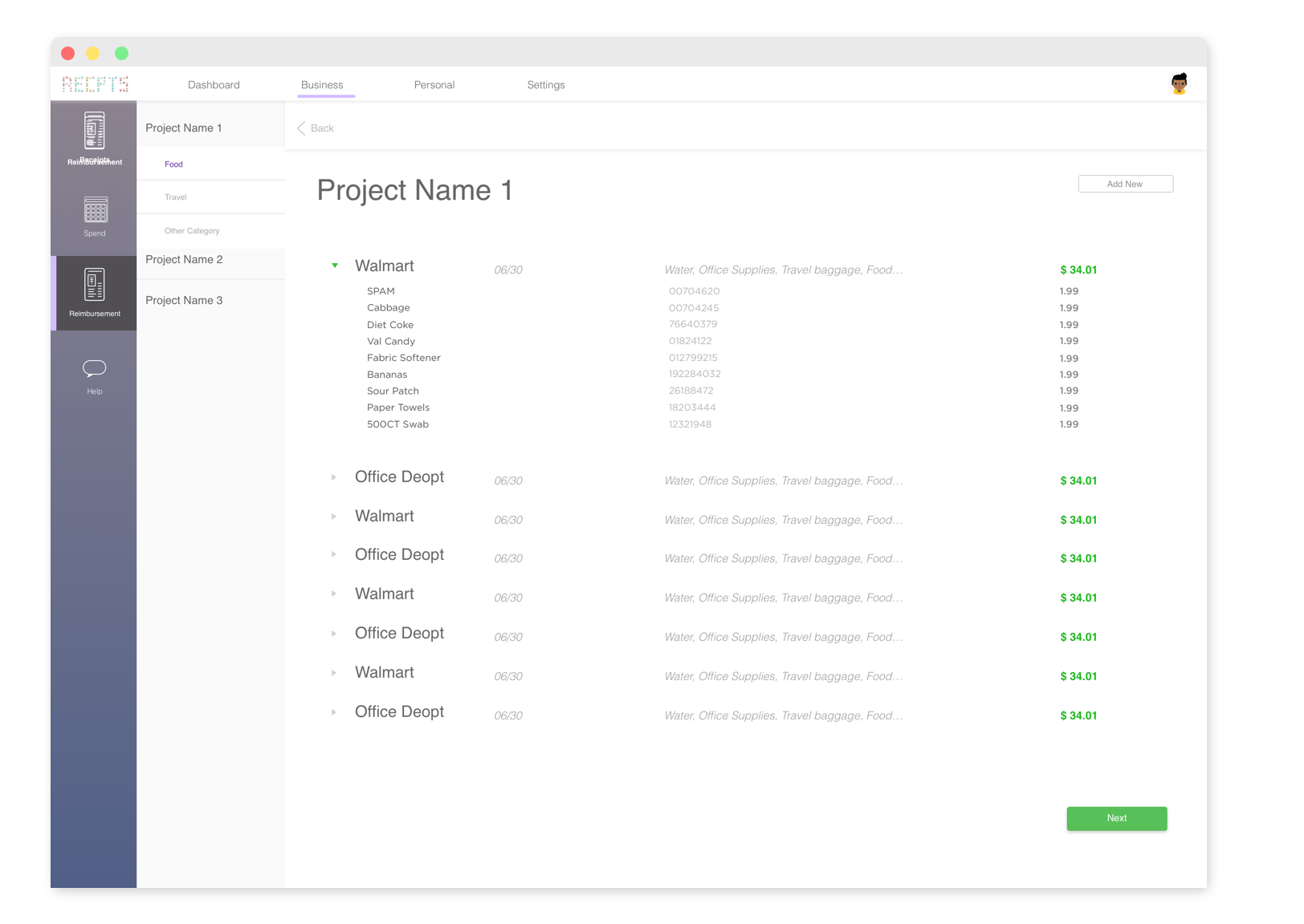
In the first step of reimbursement, users will category and indicate the project it is reimburse for. Letting users put in all information in one step is overwhelming so I chose to split information “prior to reimbursement” and “during reimbursement”.
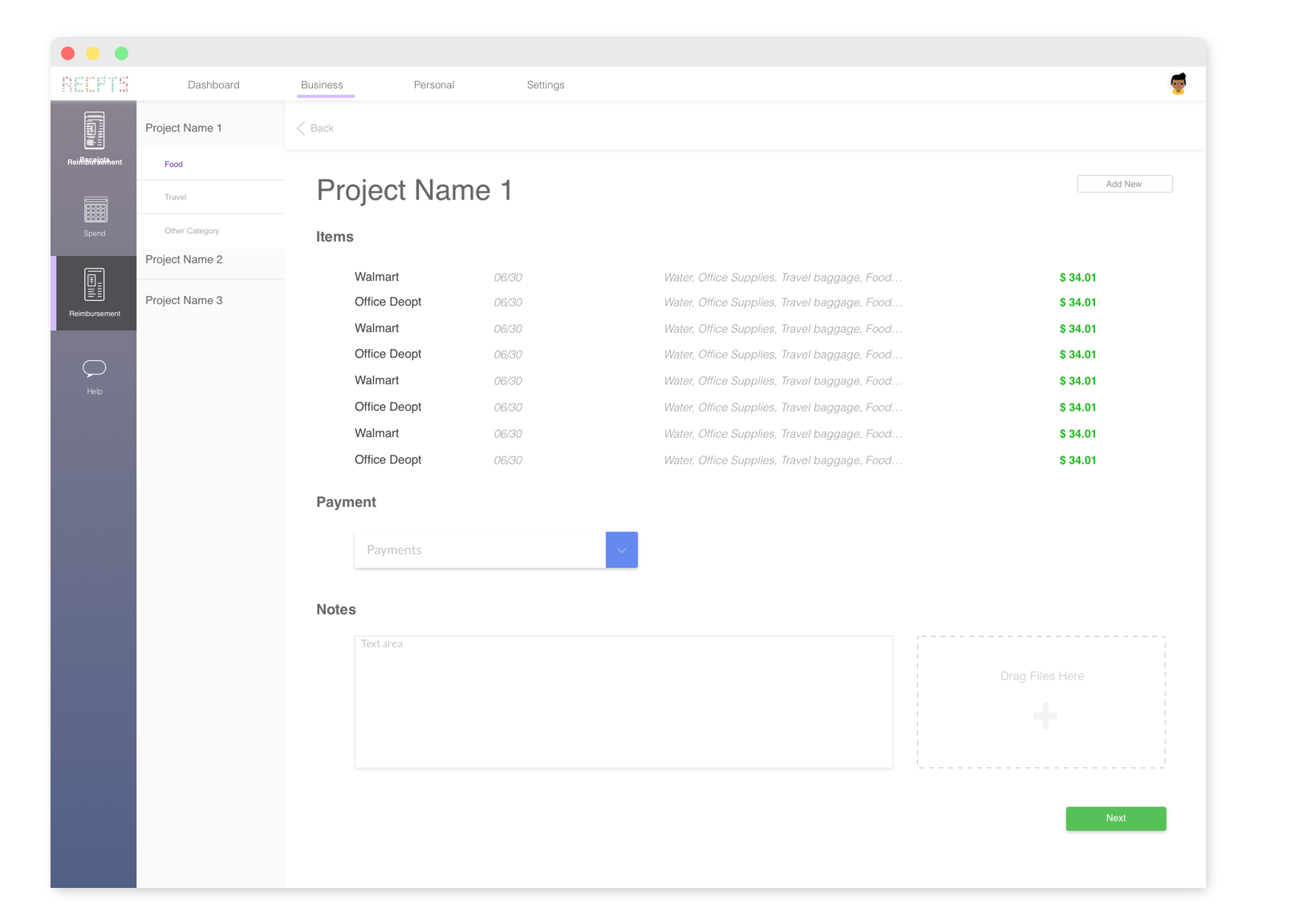
With access to modify and revise all the reimbursement items, users need to indicate the reimbursement payment method by simply selecting from previous lists. They can upload or add notes to the company if they want.
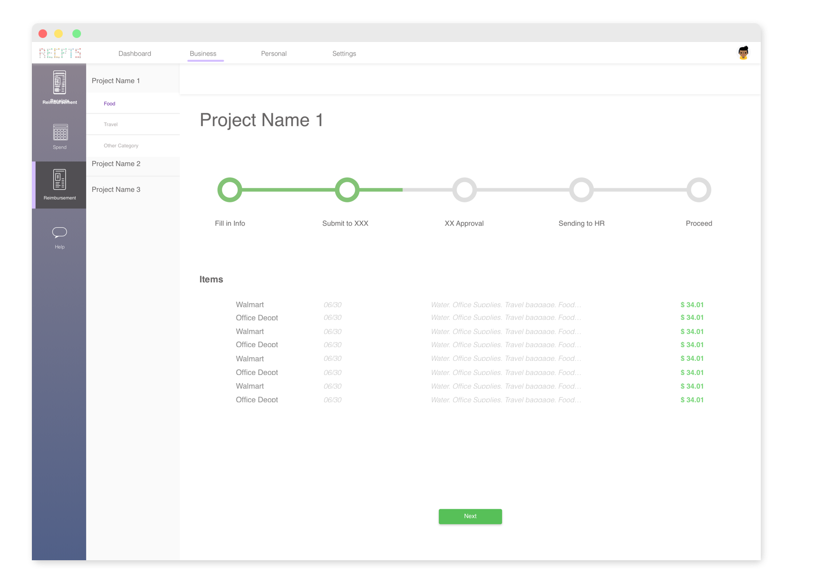
With two clicks, the process is done! Users can keep in track about the process and will be told about the person who is currently processing it.
Reflection
This project is a self driven project- the most obvious flaw is lacking of users to conduct user test. And since it’s related to the retail industry’s innovation of treating the receipts, the launch date of this idea depends on the industry.
However, this project could arouse awareness of reducing resource wasting by using electronic receipts. Personally what I learned from this project is to gather as much research data as you could in your daily life. I stared at a cashier for more than half an hour to observe how people treat their receipts and then get this idea. There’s always problems waiting for solving and as a designer, never stop observing.
Update – 05/30/2018