Racetrac Gas Station
SEAMLESS EXPERIENCE SERVICE DESIGN
PROJECT OVERVIEW
Racetrac is an American corporation that operates a chain of gasoline service stations across the Southern United States. Most of its benefits, are actually from convenience store instead of gasoline. In order to provide a seamless customer experience, new service system is designed for Racetrac.
Group Project & Responsible for Research, Illustration & CAD model.
Racetrac has made effort on selling convenience style offerings to compete
trends towards using experience to improve loyalty and the possibility of providing different types of fuels.
Additionally, being able to survive without the fueling side of the business, Racetrac is currently making effort on building the convenience store experience.
Industry research provides four types of customers – quality conscious urbanites, convenience store shoppers, want-it-alls, and price shoppers.
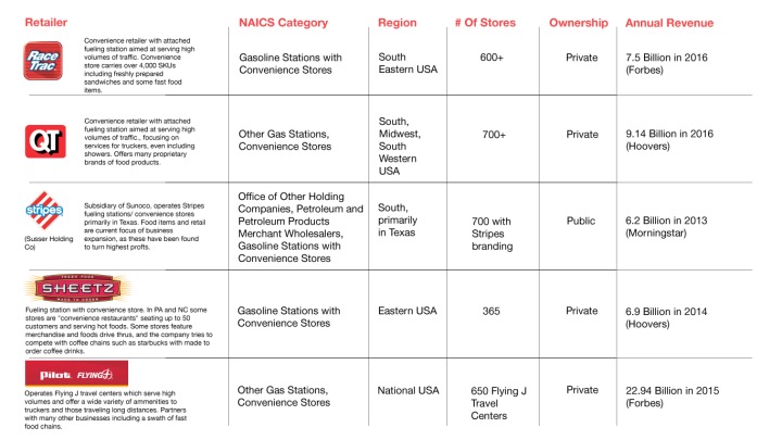
Racetrac is not the only brand that would be affected by the future trends of electric cars. Competitors’ analysis is provided in a table to show comprehensive trends and comparison between different gas station brands. Each brands is developing its own strategy to survive.

Our team conducted two visits to Racetrac store at Howell Mill Rd & Norcross and took two observations during both weekdays and weekends.
Our user observation is conducted in a concealed position which is allowing users acting their most natural activities. The aim of this observation is mainly create frequently user map and purchasing process.
After observing typical users in Racetrac, two customer behavior map from customer perspective and store perspective is provided for designers to looking for inspirations.
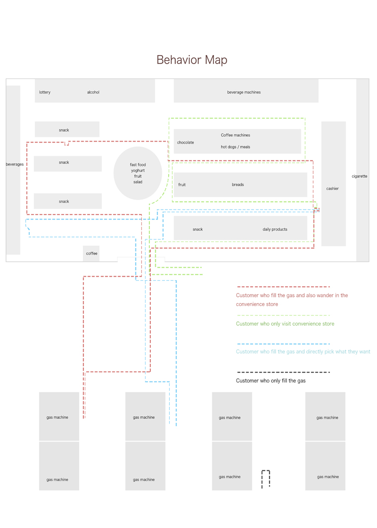
Also based on the observation, two types of typical users are observed to be the extreme user of Racetrac convenience store. They represented two totally different types of customers which have totally different demands.
The first type of users are our main current customer. construction labors that come to our store for lunch and break. He usually comes at noon , five or six times a day. What he does is quite same everyday. He parks at the store, enters and takes a sandwich or a hotdog. He went to beverage bar for a diet Coke, and sometimes he buys a pack of cigarette. After payment, he always go outside the store to the smoke patio for a short rest.
The other customer group is future potential users who are a “soccer mom”. She may not be the mommy of every kids. Some of them may be her friends’ or her cousin’s children. She usually take 5-6 kids same time to the store and looking for a place to rest and fulfill children’s demands of entertainment. For her, the prior demands is not food or drink. It is experience of relaxing and allowing her children to play. The current Racetrac stores have frozen yoghurt bar and multiple self-making food choice, which have the potential to service this user type.
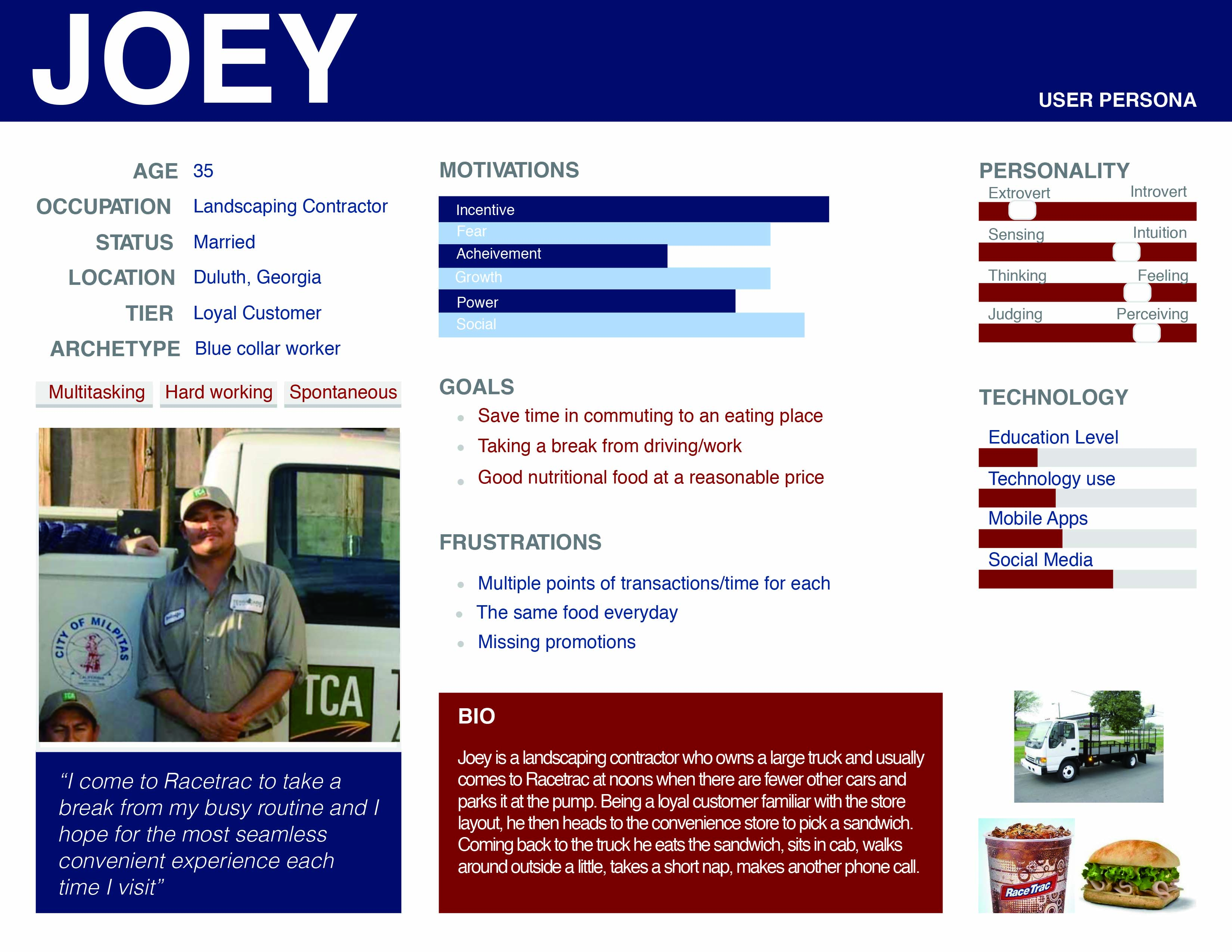
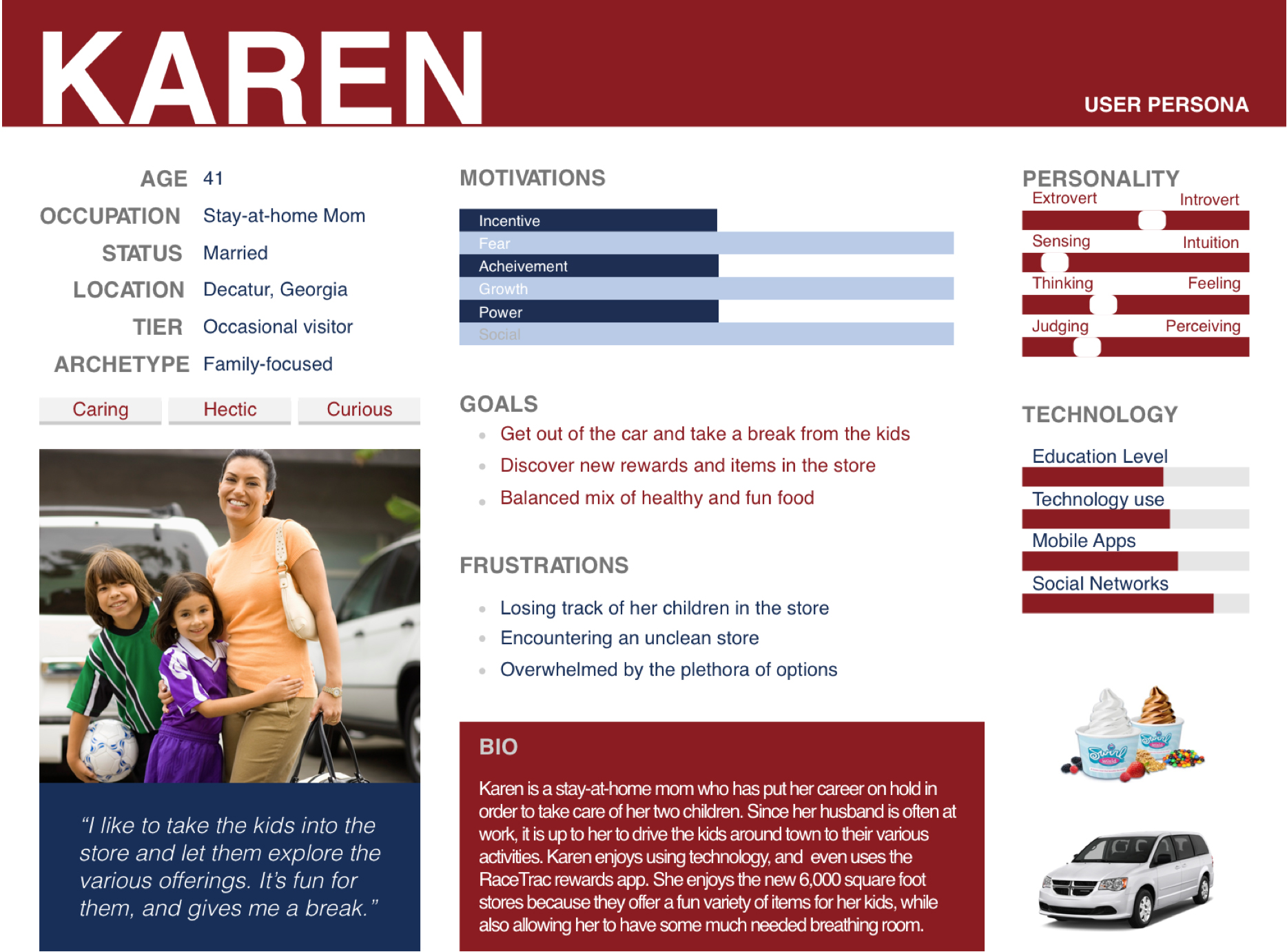
After getting the personal, the second field observation is conducted at another Racetrac store (Norcross). We are aiming at our specific user persona.
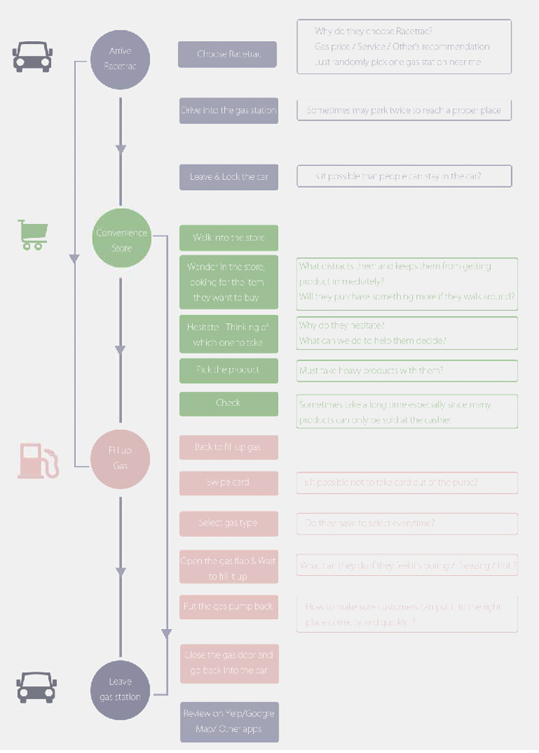
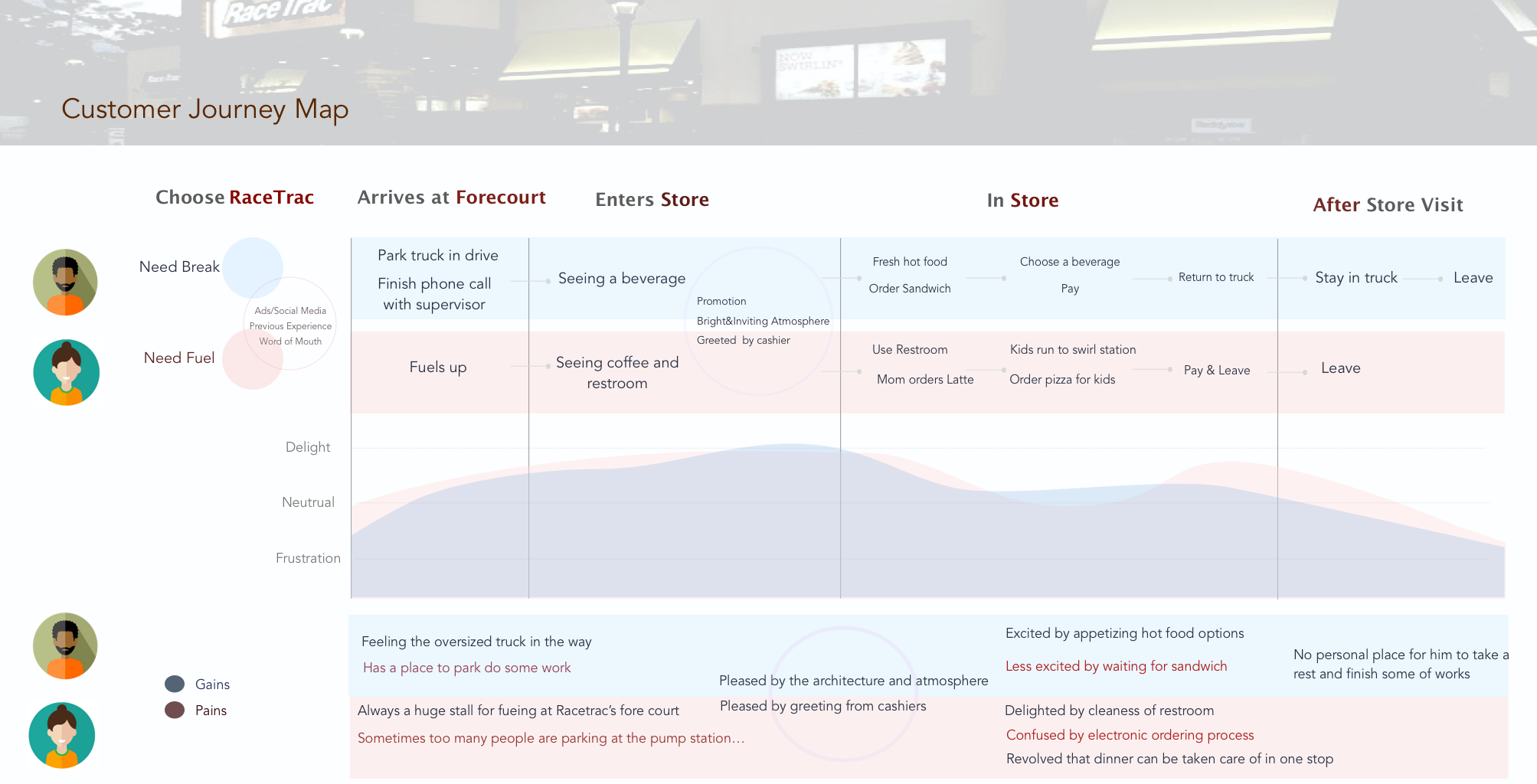
We created customer journey map based on the observation to track customer’s typical experience and mood. Group members are involved in the process as well.
We imagined ourselves as a typical user and repeated his shopping route in the store. We recorded the element that arouse our mood and the troubles we met. The map is helpful when we are trying to looking for pain point.
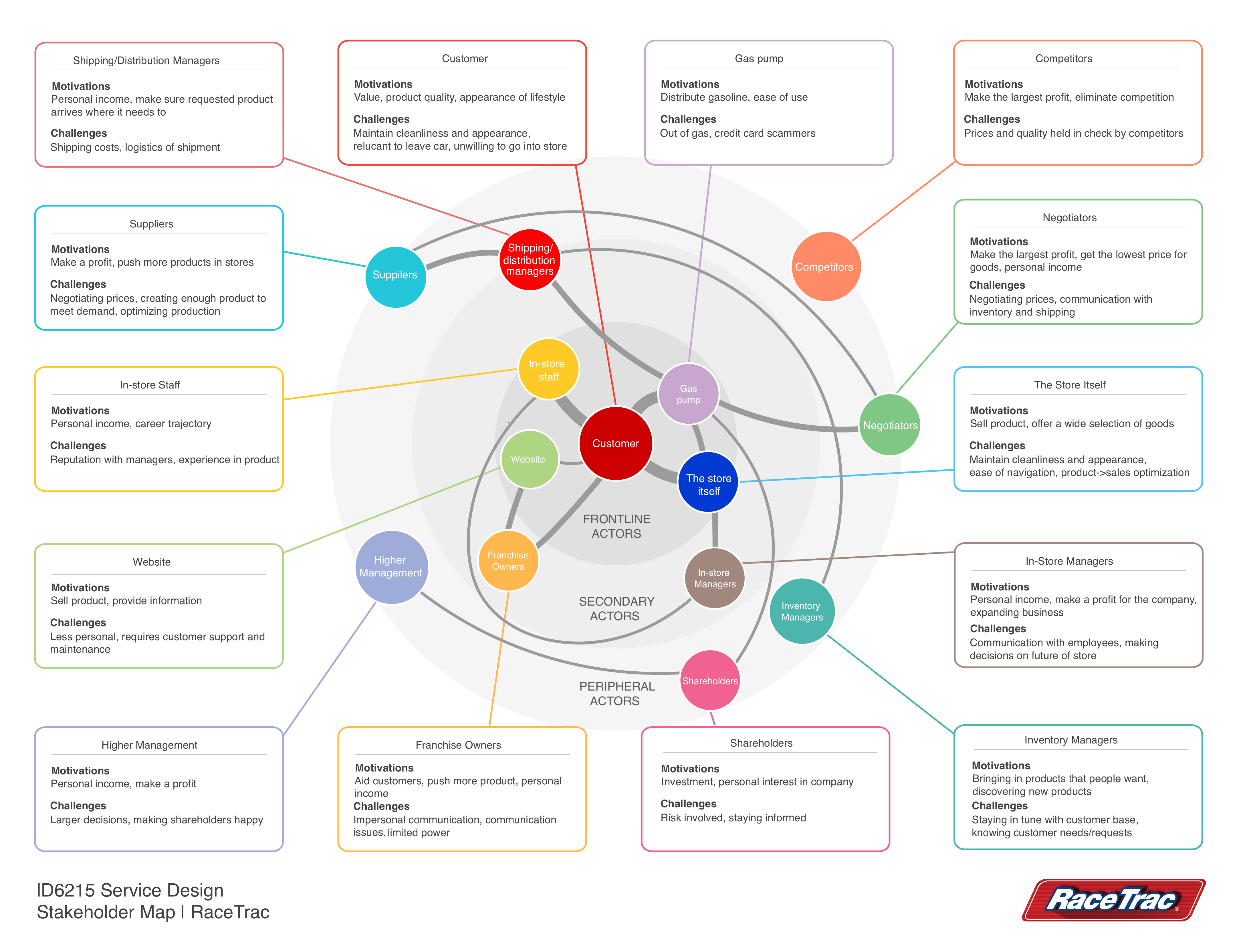
The other aspect is also important which is stakeholder input. Unlike finishing a school project, designing for clients must meet their requirement and limit.
In order to fully consider clients’ input, 2 interviews and 1 phone call talking was conducted. Information gathered from clients are recorded as a stakeholder map.
Taking stakeholder into consideration is helpful for us to control project timeline and cost. From the conversation we learned that RaceTrac is trying to focus more on convenient store based gas station rather than simply selling gas – Actually the revenue Racetrac is making is most generated from convenience store for now. The stakeholder also mentioned that in future when electrical vehicles are prevalent, even gas station function may be canceled from their marketing plan. Comparing other gasoline stations, Racetrac is trying to establish the brand image of a “deli – restaurant – convenience store – rest station” function.
From the analysis of user behavior map, “Seamless” is what we need for this experience design. Current service is interrupting customers from multiple aspects including parking, purchasing, ordering food, looking for place to eat and payment.
However, it’s impossible for us not having any restrictions.
We used LEGO to build up a physical prototype of Racetrac gas station. While we imagine our main character – Joey, walking through his shopping experience, those steps needs improvement start appealing.
Using LEGO or other rapid physical prototype is a straight-forward way to get real detailed user process during a design and is easy to communicate when there’s new ideas. When we conducting the Racetrac model testing, we found that the service process could be divided into 3 parts : Parking, Shopping and Dinning. In parking period, the “paused” joint is when users need to find a place to park. In rush hours, there may be difficulty to get an ideal parking experience.
During Shopping, the experience is full of fun for most of users we observed. Racetrac is suitable for nearby labors to have a lunch and short rest. Especially Racetrac stores are mainly located nearby highways, which is more likely to access
After brainstorming on how to solve those problems, draft story board is created to document our innovation points.
– Recording video for innovation points is more straight forward.
After finalization, the service blue print video is created based on CAD prototype which helps us establishing a sense of scale. Making a travel process using the camera perspective also helps us using first character angle.
Check our Video for demonstration of customer journey of Joey!
Reflection
The 3-months project provided with a great challenge to work with NCR and Racetrac directly. What I learned from this project is the experience of balancing what the user needs & what your client needs. As a design student, it’s very likely for us to stand at the user’s perspective – that’s a good thing. However, being a designer in an enterprise, what you need to do is more than that. The company’s strategy, trends, the future of the field, business budget, co-working with other department, etc.. Never think that’s “none of my business”. A good designer is a screw in an enterprise, but more than a screw.
